In the fast-moving world of B2B sales, your website often serves as the first handshake, the first impression, and the first proof that you mean business. If your website design has missteps, you risk losing potential clients before you even get a chance to explain your value. Below are seven of the most common website design mistakes B2B companies make — and how you can fix them to generate more trust, more leads, and more conversions.
Not Communicating a Clear Value Proposition
Many B2B websites open with vague statements about “innovating” or “being the market leader.” They focus heavily on features or internal metrics rather than on what really matters to the visitor: what’s in it for them. A visitor should be able to tell within a few seconds:
- Who you help
- What problem do you solve
- Why are you different or better
When you don’t lead with that clarity, visitors leave confused, bounce rates go up, and conversions suffer.
How to Fix It
- Start with a strong headline immediately visible on your homepage (“hero” section). Use simple, benefit-driven language: “We help mid-sized manufacturers reduce downtime by 30%” is better than “Innovative solutions for downtime management.”
- Use subheads and supporting copy to reinforce the benefit and briefly explain how you deliver it, without jargon.
- Include visuals such as icons, images, or short explainer videos that support the message.
- Make sure your Unique Selling Propositions (USPs) are obvious: what makes you unique (faster service, better integration, lower cost, more reliability, etc.).
- Test, with users or via analytics, whether your messaging is resonating. If people leave without scrolling or clicking, your value proposition may not be clear enough.
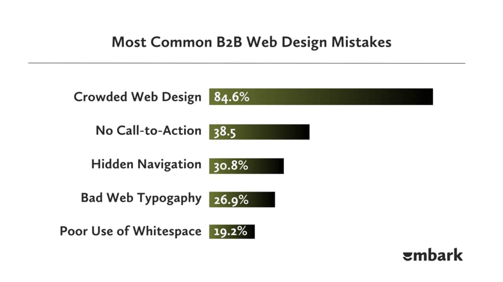
Overcomplicated or Confusing Navigation
B2B businesses often have many services, sectors, products, or resource types. This naturally leads to complex sitemaps. But when you expose all of that complexity front and centre, users feel overwhelmed. They might not find what they came for. They get lost or drop out.
How to Fix It
- Simplify top-level navigation: aim for 5-7 key items. For many B2B sites, these could be: Services/Solutions, Industries/Use Cases, Resources/Insights, About Us, Contact.
- Use descriptive, familiar labels, and avoid internal jargon. Think from your visitors’ perspective: what do THEY look for? What terms do they use?
- Provide a search bar in the header for those who want to go directly.
- Include breadcrumbs when pages are nested deep; ensure footer navigation covers important but less prominent pages.
- Use clear information architecture: organise content in logical groups so users understand where they are and where to go next. Layer information by starting at a high level and drilling down into details.
Ignoring Mobile Users and Responsiveness
A large and growing proportion of traffic in B2B browsing happens via mobile or tablet. Sometimes someone research on their phone and later returns to a desktop, but if the mobile experience is bad, you lose trust and might lose those leads entirely. Slow mobile load times, text too small, buttons hard to tap, all damage usability and SEO.
How to Fix It
- Use responsive design so layouts adapt to varying screen sizes.
- Make buttons big enough for easy tapping. Leave adequate padding so fingers don’t click the wrong thing.
- Prioritize mobile performance: compress images; avoid heavy scripts; reduce unnecessary animations.
- Ensure forms work well on mobile with shorter fields, easy input, and minimal typing.
- Test across many devices and browsers. Use tools like Google’s Mobile-Friendly Test. Monitor mobile UX metrics and adjust.
Weak Calls-To-Action (CTAs)
You may spend effort crafting content, visuals, and navigation, but if people don’t know what to do next, all that work goes to waste. Weak or generic CTAs (e.g. “Submit,” “Learn More”) don’t motivate action. Worst case scenario: no visible CTA above the fold, or CTAs hidden among clutter. Potential leads drift off.
How to Fix It
- Make your CTAs bold, visually distinct (colour, size, whitespace). They should stand out from the surrounding content.
- Use action-oriented, concrete language. “Request a Demo”, “Get a Free Quote”, “Download Our Sector Report” are more compelling than “Submit” or “Contact Us”.
- Place CTAs strategically: above the fold; at the end of content that builds interest; in sidebars or sticky headers if appropriate.
- Don’t overwhelm with too many CTAs per page; use hierarchy (primary vs secondary). Make sure the flow of the page leads naturally toward the CTA.
- Test different placements, colours, copy; use analytics to see which CTAs convert better. A/B tests can help.
Poor Content Strategy and Readability
Even if your visuals are good, slow, or unengaging writing kills engagement. Many B2B websites either bury their real value under jargon or long-winded copy. Walls of text, inconsistent tone, and content that doesn’t match what the visitor wants, whether educational or product-oriented, make people leave or lose interest.
How to Fix It
- Write for clarity. Use simple language. Avoid technical jargon where possible. If you must use industry terms, explain them.
- Break up text: use headings and subheadings; use bullet points or numbered lists; add visuals, infographics, charts where helpful.
- Make content scannable: bold the key points; use short paragraphs. Most users skim first, read later.
- Match content to stages of buyer’s journey: awareness (what problem is), consideration (how you solve the problem), decision (why choose you, proof, pricing).
- Keep content fresh and updated. Add case studies, testimonials, blog posts, whitepapers or other helpful resources. That builds credibility and helps SEO.
Lack of Social Proof and Trust Signals
In B2B, purchase decisions often carry risk: cost, integration, and long-term dependability. If your website lacks real evidence that clients trust you, visitors will hesitate. Generic testimonials or nothing at all leave a gap. Trust factors matter deeply.
How to Fix It
- Highlight client logos, especially recognisable ones, on your homepage and relevant pages.
- Include case studies with concrete numbers or stories: results, process, lessons learned.
- Add testimonials (with names, titles, and photos if possible). Prefer quotes that mention outcomes.
- Use certifications, awards, security badges, and industry partner associations where applicable.
- Make privacy policy, terms of service, and data protection statements visible. If you collect data or are governed by privacy regulations (GDPR, etc.), have trust signals to reassure visitors.
Slow Page Load Times and Technical Problems
Even small delays frustrate users. Studies consistently show that many people abandon pages if loading takes more than 2-3 seconds. Technical problems (broken links, outdated plugins, compatibility issues) harm credibility. Slow sites rank poorly in search engines.
How to Fix It
- Use performance optimisation: compress and correctly size images; minimise JavaScript and CSS; enable browser caching; use a content delivery network (CDN).
- Remove or defer non-critical scripts (e.g. tracking, social widgets) so they don’t block page render.
- Regularly test site speed on desktop and mobile. Use tools such as Google PageSpeed Insights, GTmetrix, and Webpagetest. Monitor Core Web Vitals like Largest Contentful Paint (LCP), First Input Delay (FID), and Cumulative Layout Shift (CLS).
- Check for broken links, 404s, plugin conflicts. Keep the website maintained: updates to CMS, plugins, and themes.
- Ensure cross-browser compatibility: test on major browsers. Also test accessibility in colour contrast, alt text, keyboard navigation, etc.
Conclusion
Your B2B website can do more than just look professional. It can become your strongest marketing asset. To get there, you must address these common design mistakes: Be crystal clear about your value proposition. Simplify navigation so users reach what they want effortlessly. Make mobile experience a priority.
Use strong, visible calls to action. Craft content that’s readable, helpful, and aligned with buyer needs. Build trust with social proof and relevant signals. Maintain high performance and fix technical issues. If you audit your website with these seven points in mind, you’ll likely uncover several improvements that boost lead generation, reduce bounce rates, and strengthen your brand’s credibility.