In today’s digital landscape, users access websites through an ever-growing variety of devices, including smartphones, tablets, laptops, desktops, and even wearable screens. That makes making your website adapt to different screen sizes and resolutions not just nice-to-have, but essential. Enter responsive web design (RWD), the practice of building websites that deliver an optimal viewing and interaction experience across devices.
Responsive design matters because it improves user experience by ensuring your site looks good and works well on all screens. It also supports SEO, since search engines favour mobile-friendly and device-agnostic sites.
RWD reduces maintenance, because you don’t need separate websites for desktop and mobile. This article will walk you through the evolution of web design, then dive into the core principles of responsive web design, explore advanced considerations, highlight common pitfalls, and look ahead to future trends.
The Evolution of Web Design
Web design hasn’t always been flexible. In the early days of the web, pages were designed with fixed widths and pixel‐perfect layouts. Developers assumed a standard screen size, and the idea of multiple device types simply wasn’t a core concern.
As mobile devices began to dominate web traffic, this approach began to break down. Users on small screens found themselves pinching, zooming, or seeing broken layouts. The growth of tablets, phones with varying resolutions, and different screen orientations triggered a need for a new approach.
In 2010, Ethan Marcotte introduced the term “Responsive Web Design”, arguing that sites should use fluid grids, flexible images, and media queries to adapt to any screen. Today, responsive design has become standard: rather than building separate mobile and desktop sites, most web development efforts aim for one fluid design that works everywhere.
Core Principles of Responsive Web Design
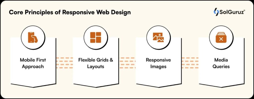
Here we dive into the foundational elements that enable a website to truly respond to its context.
Fluid Grid Layouts
A fluid grid uses relative units (like percentages) instead of fixed widths (like pixels). That way, as the screen grows or shrinks, an element set at, say, 50% width will always occupy half of its parent container.
With a fluid grid, you maintain proportional layout across devices. You also avoid horizontal scrolling and awkward white space on different screens. For example, sidebar {width: 25%;} scales more gracefully than. sidebar {width: 300px;}. The key takeaway is to design with flexibility built in, not just fixed boundaries.
Flexible Images and Media
Images and media must adapt too. If an image is fixed at 600px width, it may overflow on a small screen or look tiny on a large screen. Instead, use CSS like img {max width: 100%; height: auto;} to ensure the image scales down within its container.
For embedded videos or iframes, similar rules apply; make the width 100% of the container, height auto. Optimise images to load appropriately sized versions for smaller screens (this overlaps with performance). With flexible media, layouts remain clean and visuals remain crisp regardless of device.
Media Queries
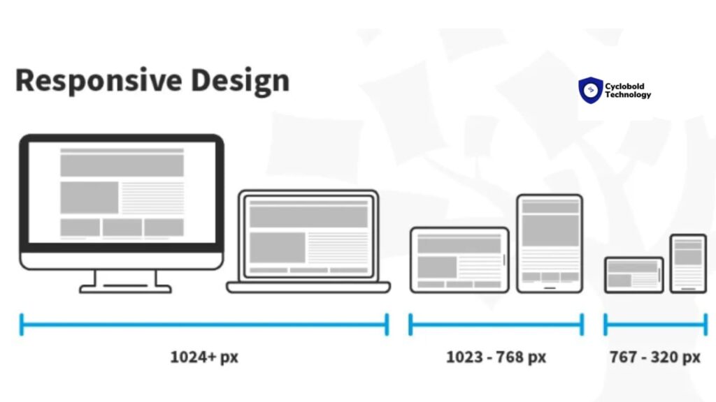
Media queries in CSS allow you to apply styles conditionally — for example, when a device width crosses a threshold. They are a cornerstone of responsive design. In practice, identify logical breakpoints – not just device sizes, but where your content layout needs to adjust.
Use media queries to adjust layout, typography, images, navigation, and even functionality. Keep your “base” styles designed for the smallest screen (mobile-first), then enhance upward. Media queries let your site respond to the environment.
Mobile-First Design
Mobile-first means designing for the smallest screen first, then scaling up. This flips the traditional desktop-first mindset and brings several benefits. So, why mobile-first?
Most web traffic today originates on mobile devices. Starting small forces you to distil content and functionality to essentials. Progressive enhancement works naturally by adding richer experiences as screen size grows. In practice, set base CSS for mobile, then use media queries with min-width to adjust for tablets and desktops.
Responsive Typography
Typography matters for readability across devices. On a large screen, text that’s perfect at 16 px might feel too small on a mobile. Key considerations should be to use relative units (em, rem, vw) so that the font size can scale with context rather than fixed pixels.
Adjust line length and line height depending on screen size. Narrow screens often need shorter lines and more line spacing. Ensure headings, navigation text, and buttons remain legible and accessible on small screens. Responsive typography ensures your content remains readable and usable, no matter the viewport.
Advanced Considerations in Responsive Design
Beyond the fundamentals, building truly high-quality responsive websites involves deeper practices.
Performance Optimisation
A responsive design that drags on speed undermines user experience, especially on mobile networks and lower-end devices. Key performance strategies would be to compress and appropriately size images (serve different image versions by viewport).
Use lazy loading for below-the-fold images and media. Minify CSS and JavaScript to reduce render-blocking resources. Use a Content Delivery Network (CDN) and caching mechanisms to improve load times globally. Faster sites keep users engaged and reduce bounce rates, especially on mobile.
Accessibility and Usability
Responsive design must include accessibility so that all users, including those with disabilities, can interact effectively. Highlights include ensuring touch targets (buttons, links) are large enough and spaced appropriately for finger taps.
Maintain sufficient contrast, readable font sizes, and logical navigation order. Use semantic HTML, ARIA roles, and proper alt text for images. Test across devices, browsers, and assistive technologies. Inclusive responsive design is both the right thing to do and increasingly expected by users.
Frameworks and Tools
You can build responsive sites from scratch or use frameworks that provide grid systems, responsive utilities, and components. Examples are Bootstrap, Tailwind CSS, and Foundation.
- Pros: Faster development, built-in responsiveness, community support.
- Cons: It can become bloated if you only need a small part and may reduce flexibility or force you into certain patterns.
Also consider responsive testing tools and emulators to preview layouts across devices.
Design Consistency and User Experience
Responsive design involves more than making your layout scale. It’s about delivering consistent branding, navigation, visual hierarchy, and experience across devices. Tips:
- Maintain consistent typography, colour palette, and iconography across viewports.
- Adjust navigation for smaller screens (e.g., use “hamburger” menus or collapsible menus).
- Make sure interactions (scrolling, tapping, swiping) feel natural on each device.
- Prioritise content: for smaller screens, show the most important content first; hide or postpone secondary content if needed.
A responsive site isn’t just “one site that works everywhere” — it feels right everywhere.
Common Mistakes and How to Avoid Them
Even experienced designers fall into pitfalls when implementing responsive design. Here are a few frequent mistakes and how to sidestep them.
- Relying blindly on framework defaults: Using a responsive framework without tailoring it can lead to bloated CSS or a design that doesn’t match your brand. Take time to customise.
- Too many breakpoints: Over-fragmenting the layout by creating dozens of breakpoints can complicate maintenance. Instead, use content-driven breakpoints — change layout when the content needs it.
- Neglecting touch interactions: Many sites convert desktop interactions (hover, precise clicks) directly to mobile without rethinking them for taps and swipes. Ensure mobile interactions are meaningful.
- Ignoring performance on mobile: A beautiful, responsive layout means little if it loads slowly or drains battery. Test on real mobile devices and networks.
- Inconsistent typography or navigation across devices: Users switching between mobile and desktop should feel they are on the same site. Branding and UX flow should remain coherent.
By being aware of these pitfalls and proactively addressing them, you raise the likelihood of delivering a truly effective responsive design.
Future Trends in Responsive Web Design
Responsive web design continues to evolve. Here are a few trends shaping its future:
- Container Queries: Whereas media queries react to viewport size, container queries (emerging in CSS) enable components to adapt based on their parent container’s size — increasing modularity in responsive design.
- Foldables and New Form Factors: As devices such as foldable phones and large-format tablets become more common, responsive design needs to handle more varied screen shapes and aspect ratios.
- Performance and Core Web Vitals: Google and others focus more on performance metrics (like page load speed, interactivity, and layout stability). Responsive design must integrate performance optimisation intrinsically, not as an afterthought.
- Personalisation and Context-Aware UIs: Responsive layouts may increasingly adapt not just to screen size, but to user context: orientation (portrait/landscape), connection speed, device type (tablet vs phone), even ambient conditions.
- Accessibility Integration by Default: As regulations and user expectations rise, responsive design will integrate accessibility from the ground up, not as an add-on.
By staying aware of these trends, you keep your designs future-friendly and resilient to change.
Conclusion
Responsive web design isn’t just about making a site look good on a phone. It’s about embracing the principle that your website must adapt fluidly, flexibly, and intelligently to an ever-changing device ecosystem.
Let’s recap the key principles: Use fluid grids and relative units so layouts scale proportionally. Ensure images and media adapt smoothly within their containers. Leverage media queries to customise layouts for device contexts. Adopt a mobile-first mindset, then build up for larger screens. Attend to typography, usability, accessibility and performance throughout.
As you apply these principles, keep testing, stay user-focused, and iterate. The web doesn’t stand still — your design shouldn’t either. Start with small screens, build for the big world, and deliver experiences that feel native no matter the device.