Smartphones and tablets now dominate web access. Even in 2025, mobile traffic accounts for the majority of visits on many sites. If your mobile experience lags, users will bounce, and Google will penalise your outranked pages.
You must treat mobile optimisation not as a checkbox, but as a core pillar of your digital presence. In this article, I’ll guide you through how to audit your mobile site, implement optimisations, avoid common mistakes, and maintain excellent mobile performance going forward.
By the end, you’ll know how to transform a subpar mobile user experience into one that’s fast, intuitive, and SEO-friendly.
The evolution from responsive to experience-first
Early mobile optimisation meant “make things shrink down” with responsive layouts that adjusted columns and images. Over time, designers layered adaptive experiences by displaying different content on each device. Today, optimisation demands more context awareness, performance prioritisation, accessibility, and personalisation.
In 2025, mobile-first means experience-first: start by considering what the mobile user needs, such as speed, clarity, or minimal friction, and build outward. Here are key trends reshaping mobile optimisation now:
- AI-driven UX personalisation: Sites increasingly adapt content, layout, or CTAs based on user behaviour or profile (e.g. past sessions).
- Progressive Web Apps (PWAs): Users expect near-native app performance with offline support, push notifications, and fast loading.
- Voice & gesture navigation: As voice assistants penetrate mobile, sites need to support conversational queries and gesture-based UI.
- Updates to Core Web Vitals & metrics: Google continues refining how it measures speed, interactivity, and layout stability; staying current is essential.
Speed and usability aren’t “nice-to-haves”, they directly impact retention, conversions, and search rankings. A site that loads in 1 second can convert at much higher rates than one that lags. Even a 0.1-second delay can erode user trust.
Moreover, Google now prioritises metrics that reflect real user experience, not synthetic lab tests. To succeed, your mobile site must deliver not just responsiveness, but perceived responsiveness—fast, smooth, and predictable!
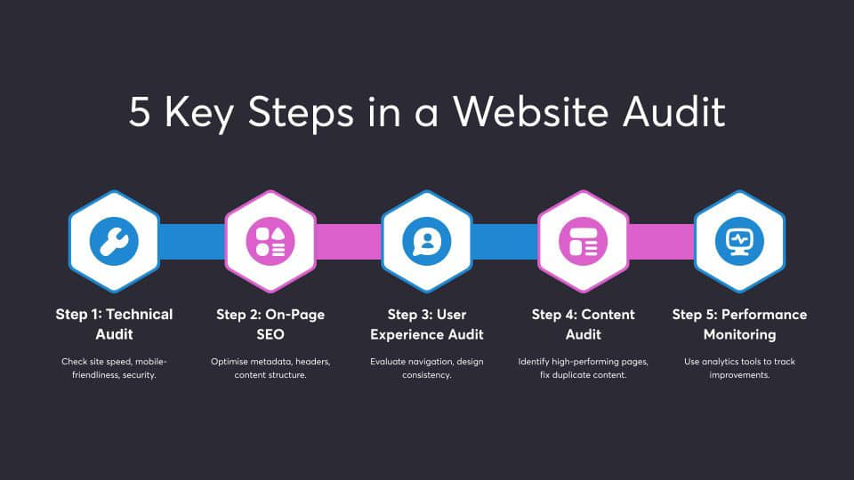
Step 1: Conducting a Mobile Site Audit
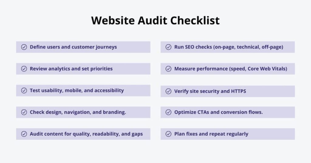
A thorough audit reveals pain points, allowing you to target high-impact fixes first. Start with Google’s Mobile-Friendly Test to surface obvious usability issues such as touch targets, viewport settings, and font sizes. Then dive into Search Console’s Mobile Usability reports to spot crawl, viewport, or viewport-zoom errors.
Check out any flagged issues (e.g. “clickable elements too close”) and tie them to specific pages or templates.
Test Core Web Vitals (mobile version)
Use PageSpeed Insights/Lighthouse to measure your mobile site on:
- Largest Contentful Paint (LCP) — how long before the main content becomes visible
- Interaction to Next Paint (INP) — how responsive your site feels after interactions.
- Cumulative Layout Shift (CLS) — how much elements move unexpectedly while loading
Also, examine field (real user) data in Search Console’s Core Web Vitals report. It groups pages by status (“Poor,” “Needs improvement,” “Good”) based on real usage. Document which pages underperform and by how much. That gives a roadmap for fixes.
Review mobile structure & navigation
On mobile:
- Keep menus shallow (2 levels max).
- Use hamburger or bottom navigation bars for key actions.
- Avoid hidden navigation (e.g. only in three-dot menus).
- Ensure tap targets meet recommended size (around 44–48px or roughly 9mm) so users don’t mis-tap.
Test on real devices (or emulators) to ensure navigation feels comfortable with the thumb.
Audit content readability & layout
On mobile:
- Use readable font sizes (e.g. minimum 16px or equivalent).
- Use sufficient line height and paragraph spacing.
- Keep content sections narrow to reduce horizontal scanning.
- Avoid dense blocks of text—break into short paragraphs, bullets, headings.
- Ensure media (images, videos) scale responsively without overflow.
A poor reading experience kills engagement faster than a slow load.
Check mobile SEO issues
As you audit, also verify:
- Mobile-first indexing consistency: Google uses the mobile version to index and rank pages.
- Canonical & meta tags alignment across mobile/desktop versions.
- Structured data presence (same schema on mobile).
- Hreflang tags, redirects, and crawl paths behave identically on mobile.
- Robots.txt/sitemaps allow mobile bots access to necessary resources (CSS, JS, images).
Make a prioritised list of pages with poor CWV, broken navigation, content layout issues, or SEO inconsistencies.
Step 2: Technical Optimisation for Mobile

Fixing technical issues yields the biggest performance gains.
Implement responsive or adaptive design properly
Responsive design remains the default best practice; you don’t want separate mobile/desktop code versions. Utilise fluid grids, CSS media queries, and container queries emerging in 2025 to adapt layouts. Adaptive design (serving variant templates per device) still has use in complex apps, but it increases maintenance costs. Also consider dynamic viewports that allow the browser to adjust scaling and layout based on content.
Optimise page speed aggressively
Focus on these:
- Image & media optimisation: Use modern formats (WebP, AVIF), compress wisely, generate responsive sizes, and lazy load offscreen images.
- Minify and tree-shake CSS/JS/HTML to remove unused code.
- Defer non-critical scripts and load essential JS first.
- Use efficient caching strategies & CDNs so users fetch from the nearest servers.
- Enable compression (Brotli or Gzip) and set proper HTTP caching headers.
- Critical rendering path optimisation: inline above-the-fold CSS, reduce render-blocking assets.
These optimisations help your Largest Contentful Paint (LCP) and interactivity scores.
Improve Core Web Vitals on mobile
For each metric:
- LCP: Reduce server response time (TTFB), preload key fonts/images, optimise above-fold content.
- INP: Break up long tasks, defer heavy JS, keep main thread free.
- CLS: Reserve space for images, ads, embeds; avoid insertion of above content that pushes layout; use font-display CSS rules.
Continuously monitor as you make changes.
Leverage PWAs for better experiences
Converting or layering your site into a Progressive Web App gives mobile users:
- Faster repeat loads via caching
- Offline support
- Installable experience (home screen)
- Push notifications
When PWA features align with your business goals (e.g. eCommerce, content apps), they offer a compelling user experience and higher engagement.
Step 3: Enhancing Mobile UX and UI
Even a technically fast site fails if the UX is poor. Here’s what you have to do:
Simplify navigation & reduce friction
- Keep key actions reachable (bottom nav, floating buttons).
- Prioritize most-used features; hide secondary ones deeper.
- Use intuitive icons + labels.
- Reduce form inputs; use auto-fill, smart defaults, and single-field workflows.
- Provide feedback (spinners, progress) when actions take time.
Optimize for accessibility & inclusivity
Accessibility isn’t optional; it expands your reach and aligns with best practice:
- Use proper ARIA labels, semantic HTML, and alt text.
- Ensure contrast ratios meet WCAG standards.
- Support voice navigation and screen readers.
- Design keyboard-friendly interactions—some users may navigate via external keyboards or assistive devices.
Enhance visuals for mobile contexts
- Use responsive images and art direction to serve different crops for each device.
- Support dark mode by detecting user preference and adjusting visuals.
- Use subtle motion/animation such as transitions or micro-interactions sparingly to delight the eyes, but never at the cost of performance.
- Avoid visual clutter by prioritising white space, minimalism, and clarity.
Ensure consistency across devices & platforms
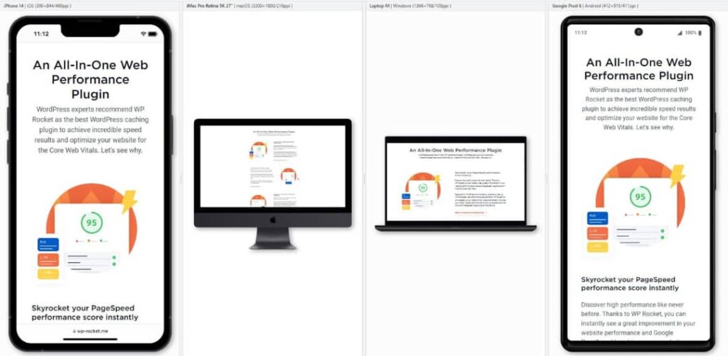
Test across multiple screen sizes (small phones to foldables), different browsers and OS (iOS, Android), and real devices, not just simulators. Verify layout, performance, and behaviour remain consistent. Use cross-device testing tools (e.g. BrowserStack) to catch edge cases.
Step 4: Mobile SEO Optimisation
Performance and UX matter, but you must pair them with smart SEO for mobile success.
Prioritise mobile-first indexing & crawlability. Google now indexes based on the mobile site. If your mobile version lacks content or hides resources, you lose visibility. Keep canonical, structured data, and meta elements consistent. Supply all CSS/JS/images so mobile bots can render pages properly.
Optimise for local & voice search. Because many mobile searches have local intent, ensure your Google Business listing, local schema, and address/phone data appear clearly. Use conversational, question-style keywords (e.g. “where to buy shoes near me”) to capture voice search. Make use of FAQs or structured answers that voice assistants can draw from.
Use structured data & rich snippets. Structured data (JSON-LD) helps generate rich results, which amplify mobile SERP visibility. Add schemas for reviews, products, articles, etc. The same markup you use on desktop should appear on mobile.
Reevaluate AMP’s role in 2025. AMP once offered lightning-fast pages, but its necessity has declined. If your site already performs well on mobile, the overhead of maintaining separate AMP versions may not pay off. Still, for some publishers, it can help with mobile speed and visibility, especially in Google News contexts.
Step 5: Monitoring & Continuous Improvement
Optimisation is never “done.” Keep refining. Set mobile performance KPIs by tracking metrics like bounce rate (mobile), session duration, conversion rate (mobile), and page-level Core Web Vitals over time. Focus on changes you make and their impact: e.g. “I improved LCP by 0.5s on product pages—did mobile conversions rise?”
Behaviour tools like heatmaps, session replays, and scroll maps help you understand how users interact on mobile: Where do they tap? Where do they hesitate or drop off? Which elements distract them? AI-driven tools (e.g. auto-insights) can identify anomalies you may miss.
Schedule quarterly mobile audits to uncover new issues or regressions. Stay current with Google algorithm updates, new device types, and emerging best practices. When you deploy changes, run A/B tests to validate improvement. Never assume your fix always helps.
Common Mobile Optimisation Mistakes to Avoid in 2025
Even seasoned teams slip up. Watch out for these:
- Heavy animations or videos that block or slow down rendering.
- Ignoring accessibility standards isolates users and can potentially harm SEO.
- Relying on outdated frameworks without checking performance cost.
- Skipping real-device testing—simulators often hide real-world behaviour.
- Differing content between desktop and mobile by leaving out text, links, and schema, which breaks mobile-first indexing.
- Over-reliance on third-party scripts (ads, trackers) that slow your page.
Catch and eliminate these before they sink the user experience.
Tools & Resources for Mobile Optimisation
Here’s a list of tools to support your audits, testing, and monitoring:
- Google PageSpeed Insights/Lighthouse for lab, field metrics, and CWV diagnostics.
- Search Console (Core Web Vitals report, Mobile Usability)
- BrowserStack/real device labs for cross-device testing.
- GTmetrix/WebPageTest for deep performance analysis.
- Hotjar, Microsoft Clarity for heatmaps and session replays
- UX prototyping tools (Figma, Adobe XD) to design and test mobile layouts
- Performance platforms & plugins (for CMS): caching, asset optimisation, CDN.
Leverage these continuously—not just during the initial audit.
Conclusion
In 2025, mobile optimisation is no longer an optional add-on; it’s foundational. A fast, smooth, readable, and SEO-aligned mobile experience directly influences rankings, conversions, and brand perception. Use our five-step process: Audit your mobile site, fix technical issues, elevate UX & design, align with mobile SEO, and monitor and iterate.
Run your audit today. Identify your weakest pages and attack the biggest wins first. Over time, your mobile experience becomes a competitive advantage, not a liability.