First impressions matter — especially online. In as little as 50 milliseconds, a visitor forms an opinion about a website’s appeal, trustworthiness, and usability. Colour plays a huge role in that quick judgment.
There is power to colour in design because emotions are summoned when we view certain colours. Far more than decorations, colours communicate mood, represent brand values, guide user attention, and even influence behaviour. Whether consciously or subconsciously, users respond to colour cues — from the “Buy Now” button to the background hues, from navigation links to hover states.
For web designers, marketers, and brand strategists, understanding colour psychology is essential. The right palette can bolster engagement, enhance readability, motivate actions, and build trust. The wrong palette can confuse, repel, or misrepresent the brand.
In this article, we’ll explore how human perception understands colour, how colours function in web design, the psychological effects of specific hues, how to combine them wisely, and practical tips for using colours in web design.
The Science Behind Colour Psychology
Colour psychology is the study of how different colours influence human thought, emotion, and behaviour. It examines how hues, brightness, and saturation can evoke responses in the brain. These responses often happen below conscious awareness.
How our brain processes colour
When light enters the eye, photoreceptors send information to the visual cortex. But colour perception doesn’t stop there. The brain interprets hue, saturation, and luminance; it also links colour to memory, emotion, and meaning. The opponent-process theory (red vs. green, blue vs. yellow, light vs. dark) is one model explaining how our visual system detects contrasts.
However, the leap from perceiving colour to emotional or behavioural reaction is influenced by many layers, such as evolutionary, physiological, cultural, and learned associations. Researchers warn that colour-emotion links are not deterministic: they depend heavily on context and individual differences.
Connection between colour and behaviour
Empirical work suggests that colour can affect attention, cognitive load, and decision-making. For instance, high saturation and warm colours often raise arousal, whereas cooler, muted colours may calm and steady focus. Web interfaces using certain colour combinations influence how quickly users click, how long they stay, and whether they complete tasks.
Cultural and contextual variation
Importantly, colour meanings are not universal. A shade interpreted as “trustworthy” in one culture may carry negative connotations elsewhere. The “colour-in-context” theory posits that colour’s psychological meaning depends heavily on its usage and context. For example, in Western settings, white often signals purity, while in some Eastern contexts it may signify mourning. Designers working for global audiences must be especially sensitive to such differences.
In short, colour psychology provides guiding principles, but it’s not a rigid law. The meaning of colour arises from how it’s used, where, and for whom.
The Role of Colours in Web Design
Colour is one of the most potent tools in a designer’s toolkit. It works at multiple levels:
Visual hierarchy and usability
Colour helps establish what users see first, what they click, and how they navigate. Contrast between background and text, or between buttons and surrounding elements, ensures readability and draws attention to calls to action. Poor contrast undermines accessibility, especially for users with low vision or colour blindness.
Brand identity and recognition
Colours become part of a brand’s visual signature. Studies show that colour increases brand recognition by up to 80%. A well-chosen primary hue (plus supporting accents) helps users instantly identify the brand across touchpoints — from the website to social media.
Large brands often stick with consistent primary colours: think of Facebook’s blue, Coca-Cola’s red, or Spotify’s green. Their choice is not random. For example, blue conveys trust and stability, which is fitting for social platforms or corporate brands. Green often suggests growth, health, or nature, fitting for eco, wellness or financial brands.
Emotional framing of the user experience
From the moment a user lands on a page, the colour sets a tone: energetic, calm, playful, formal, serious, or whimsical. That emotional backdrop subtly influences how users interpret content and whether they act. In e-commerce, colour decisions can sway purchases. For example, bright warm colours (red, orange, yellow) often drive higher conversion rates for buttons and promos.
By combining colour with layout, typography, imagery, and micro-interactions, a designer crafts a holistic experience where colour is not decorative, but deeply functional.
Psychological Effects of Individual Colours
Below are common associations and uses of key colours in web design. Bear in mind: these are tendencies, not absolutes.
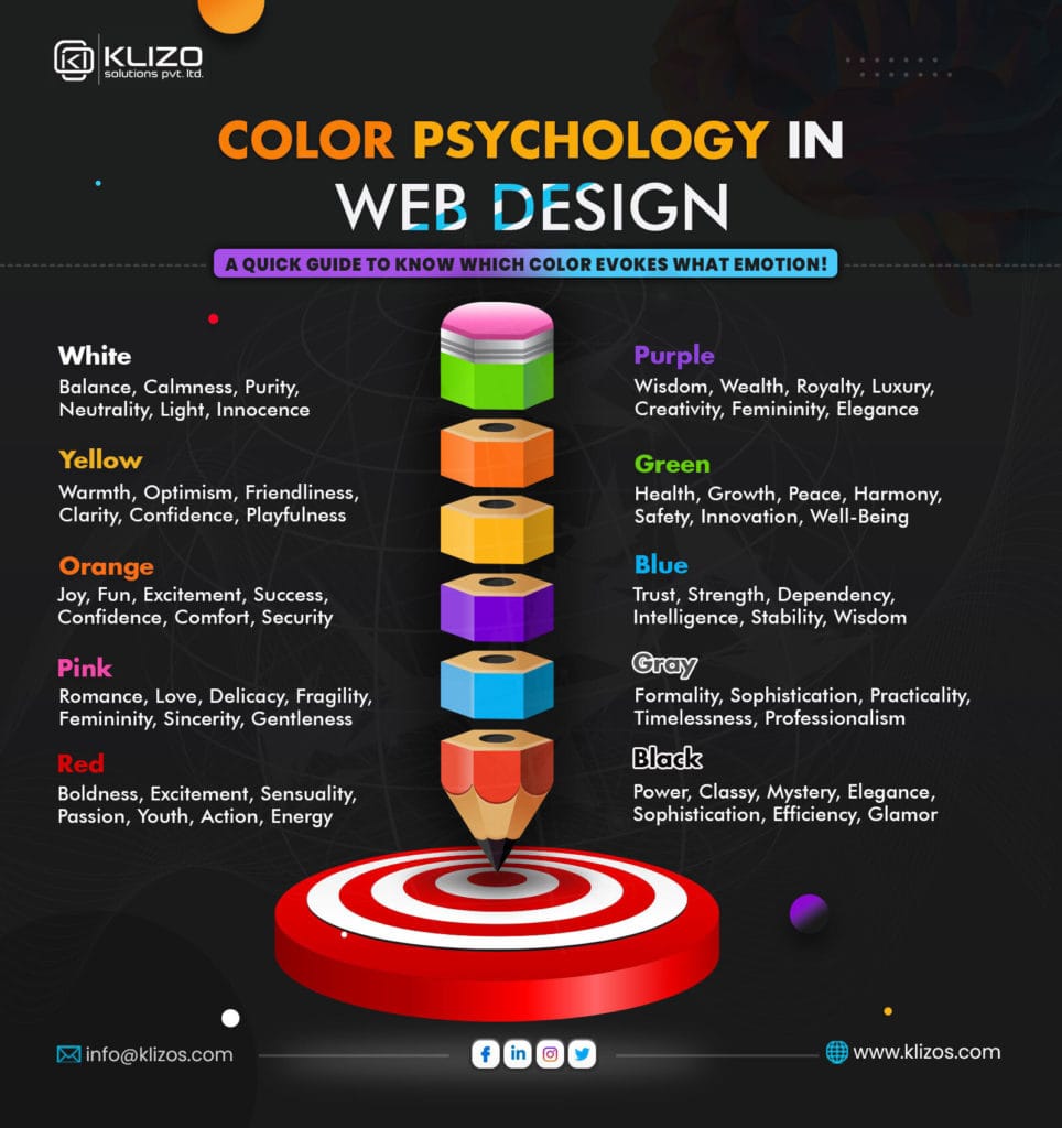
Red 🔴
Red is bold, energising, and attention-grabbing. It can evoke urgency, excitement, and passion. For this reason, it’s often used for sales, alerts, or “limited time” messaging. However, red can also signal danger or warning, so it must be used carefully. In a classic A/B test, a red CTA button outperformed green by ~21 %, possibly because red contrasted more against the page background.
Blue 🔵
Blue is perhaps the most preferred colour globally, associated with trust, stability, calmness, and professionalism. It’s no coincidence that many financial, tech, and corporate sites use shades of blue. On the neuroscience front, coloured (vs. uncoloured) websites led to greater positive responses. Blue in particular produced what the authors called “cognitive relief” in certain brain areas.
Green 🟢
Green signals growth, nature, health, freshness, and balance. It’s often used by brands in wellness, environment, and food niches. It also has a calming effect, making it suitable for content-rich or restful interfaces. Because people often associate “green means go,” green CTAs may feel intuitive and low-friction.
Yellow 🟡
Yellow is bright, warm, and optimistic, often used to capture attention or highlight caution. Because it’s very visible, yellow is used for warnings or to highlight key areas. But it’s risky as a background or text colour, particularly for readability. Yellow tends to work best as an accent.
Orange 🟠
Orange combines energy and friendliness. It’s less aggressive than red but still vibrant and engaging. Many CTAs use orange to stand out without being overly harsh. Its playful and enthusiastic quality makes it suitable for creative and lifestyle brands.
Purple 🟣
Purple evokes luxury, creativity, spirituality, or mystery. It’s often used in boutique, wellness, or artistic contexts. Lighter purples (lavenders) feel gentle; deeper purples (plum) feel more regal or moody.
Black ⚫
Black is powerful, elegant, authoritative, and timeless. It can communicate sophistication, luxury, or exclusivity. But excessive black can feel harsh or heavy. Many brands combine black with lighter accents to balance sophistication with readability.
White ⚪
White (and off-white) conveys simplicity, space, minimalism, and purity. It’s also essential for ensuring breathing room in layouts. White space is often misnamed; it’s usable space that gives visual rest.
Pink 🩷
Pink often evokes femininity, playfulness, compassion, or sweetness. Depending on the shade, it can feel youthful (baby pink) or bold (magenta). Pink can be effective in fashion, beauty, or lifestyle contexts, but should be chosen carefully to avoid clichés.
Colour Combinations and Harmony in Web Design
Getting a single colour is only half the battle. The harmony among colours, how they interact, determines if the palette feels coherent or chaotic.
Colour-theory schemes
- Complementary: These colours are opposite on the colour wheel (e.g. blue & orange). They’re high in contrast and effective for calls to action.
- Analogous colours are neighbouring colours (e.g. blue, teal, green) with gentle transitions and harmony.
- Triadic, as the name implies, are three equidistant hues (e.g. red, blue, yellow). They’re balanced, dynamic palettes.
- Split-complementary/tetradic are more nuanced approaches that allow richer palettes.
Avoiding poor combinations
Bad palettes lead to eye strain, confusion, or conflicting visual signals. Low contrast between background and text can cause readability issues; clashing hues can feel jarring and unprofessional.
Contrast and accessibility
Designers must check contrast ratios to ensure legibility and accessibility (WCAG guidelines). Colour-blind users require special consideration (e.g. avoid red/green combinations).
Examples in practice
Many modern websites use a dominant base colour, a secondary supporting hue, and a contrast accent (for buttons, etc.). For instance, a clean UI might use white + muted gray + a vibrant accent (say, teal or coral) for emphasis. Or a dark-mode site might reverse that by using a charcoal background, soft neutrals, and one bold accent.
When the palette is harmonious, users don’t consciously think about colours — they simply perceive a cohesive, trustworthy interface.
Cultural Considerations in Colour Psychology
Colour meanings shift across cultures, and global brands often adapt accordingly.
- White: In many Western cultures, white implies purity, weddings, and new beginnings. In some Asian cultures, white is used in funerals and mourning.
- Red: Red is auspicious and celebratory in many Asian cultures. But it can signal danger or anger in Western contexts.
- Black: Often associated with elegance in Western design, but in certain cultures it may connote death or negativity.
- Green: In Islam, green is tied to faith and is considered sacred in many Muslim-majority countries. Designers in those markets sometimes lean into green’s religious or cultural resonance.
Because of such variation, designers working on international or multicultural projects often perform region-specific research or A/B testing. They may select alternate palettes or even swap accent colours depending on a user’s locale. Colour context matters deeply.
Impact of Colours on User Behaviour
Colour choices on calls to action (CTAs) buttons like “Buy,” “Sign Up,” or “Learn More” often seem trivial, yet they can significantly affect conversion metrics.
Colour as a psychological trigger
Warm, high-contrast colours like red, orange, and yellow are attention magnets and tend to spur action. Tests have shown that changing button colour alone can increase click-through rates by 5–10 %. On one landing page, a button colour tweak reportedly boosted clicks by 11 %. Interestingly, even though “green” intuitively signifies “go,” red often outperforms it when used in high-contrast contexts, because it stands out more.
Case studies & A/B testing
Designers often run controlled experiments: same layout and copy, but different button colours. The version with the more contrasting, standout colour typically wins. However, there’s no universal “best colour”. It depends on the background, brand, and context.
Behavioural psychology behind it
Colour-driven urgency (e.g. bright red “Limited Offer”) taps into emotional, heuristic decision-making. Cooler or muted CTAs (e.g. soft blue) may encourage slower deliberation. Designers must choose based on whether they want an impulsive action or a considered action. In sum: CTAs are colour leverage points. Their hue, contrast, and context directly influence whether users act or hesitate.
Practical Tips for Using Colour in Web Design
- Align with brand identity: Let your brand values, target audience, and industry guide your palette. A fintech brand might lean blue and green; a creative startup might lean bold and saturated.
- Start with a primary + accent + neutral system: Use one dominant hue, one accent, and neutral tones (white, gray, black) to ground your design.
- Ensure contrast and accessibility: Use tools (e.g. WebAIM contrast checker) to adhere to WCAG guidelines. Avoid text and backgrounds that are too close in luminance.
- Consider colour-blindness and vision impairments: Use patterns, icons, or additional cues in addition to colour.
- Use colour hierarchically: Reserve bold colours for actions, highlights, or key elements; keep non-interactive content more subdued.
- Run A/B tests and iterate: Don’t rely on assumptions. Test button colours, banner accent hues, or background shifts to see what performs best with your users.
- Be consistent across platforms: Use your chosen palette consistently on mobile, desktop, and collateral (social media, email) to reinforce brand cohesion.
- Consider emotional tone and contrast: Warm colours evoke energy; cool ones evoke calm. Use them to support the emotional intent of your site.
By following these practices, you’ll design websites that feel intentional, usable, and emotionally resonant.
Future Trends in Colour Psychology & Web Design
- Dark mode & light-on-dark designs: Dark backgrounds with light text (dark mode) have grown in popularity, offering a modern, immersive feel and potentially reducing eye strain or saving power on OLED displays.
- Minimalism and neutral palettes: Many modern sites favour soft neutrals, muted tones, and minimal accent colours, letting imagery or typography carry expressive weight.
- Personalisation & algorithmic colour adaptation: With AI and data-driven UX, we may see interfaces that adapt colour schemes based on user preferences, time of day, or context (e.g. switch accents for seasonal campaigns)
- Mood-based, ambient themes: Websites might incorporate dynamic colour shifts or ambient gradients to reflect mood, weather, or user context, creating more emotionally responsive experiences.
As design trends evolve, the psychological power of colour will remain foundational even if the methods of application change.
Conclusion
Colour is far more than visual flair. It is a psychological instrument that helps shape perceptions, guide attention, and influence behaviour. In web design, every hue, contrast, and palette decision carries weight. From establishing brand identity to prompting conversions, colour works silently in the background, anchoring both emotion and logic.
Yet colour psychology is not absolute. It intersects with culture, context, individual differences, and evolving trends. The best designers pair knowledge of colour theory with empathy, testing, and iteration. When applied thoughtfully, colour can elevate a website from functional to unforgettable, encouraging trust, engagement, and meaningful action.