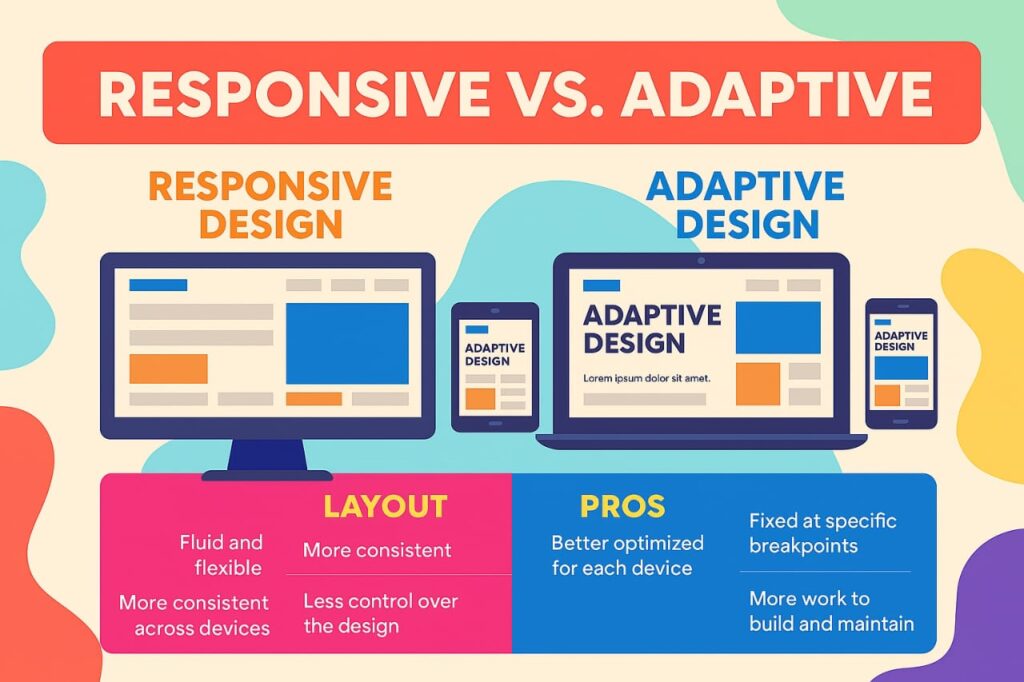
Responsive design uses fluid grids, flexible images, and CSS media queries to ensure a single layout adjusts dynamically to any screen size, whether mobile, tablet, or desktop. Conversely, adaptive design relies on pre‑designed fixed layouts tailored to specific breakpoints (e.g., mobile, tablet, desktop). The server or browser detects the device and loads the closest match.
- Responsive = one flexible layout that morphs continuously.
- Adaptive = multiple static layouts that snap into place.
Pros & Cons: A Strategic Comparison
✅ Responsive Design

Advantages
- Simplicity & affordability: A single codebase means lower development and maintenance effort—perfect for lean budgets.
- Future-proof: Supports emerging screen formats automatically, no rebuild required.
- SEO advantage: Google favours mobile-friendly, single‑URL architecture.
- Ease of use: Supported by frameworks like Bootstrap, making it accessible to developers of all levels.
Challenges
- Performance pitfalls: Responsive sites may load full desktop assets even on mobile, slowing speed.
- UX inconsistencies: Fluid layouts may misplace elements without thorough testing.
- Design overhead: Requires more initial planning, coding, and QA across multiple screen sizes.
✅ Adaptive Design
Advantages
- Optimized performance: Loads only what’s needed—often 2‑3× faster than responsive sites.
- Fine-tuned UX: Delivers pixel-perfect tailoring to device context, which is ideal for mobile-first interactions.
- Ad manager’s dream: Easy to slot ad units and third‑party content into predefined layouts.
- Legacy integration: Ideal for retrofitting older desktop sites with dedicated mobile versions.
Challenges
- Higher costs: Multiple layouts mean more design, development, testing, and maintenance.
- Device gaps: Unaccounted screen sizes may be rendered poorly.
- SEO complexity: Each layout may require separate optimisation strategies.
- Resource-heavy: Needs greater skill and time, as builders and agencies often lack support.
Choosing the Right Path
There’s no one-size-fits-all. Your choice hinges on three critical factors:
Audience & Analytics
- If your users span a vast range of devices, including rare screen sizes, responsive design provides seamless coverage.
- If usage clusters around a few known devices (e.g., shopping app users), adaptive enables targeted excellence.
Performance Needs
- For fast-loading mobile experiences and minimal bandwidth, adaptive wins. Only essential assets load per device.
- If performance is less critical and your tech stack relies on frameworks, responsive is perfectly viable.
Budget & Maintenance
- Responsive: lower cost to launch, faster updates, easier long‑term upkeep.
- Adaptive: higher upfront and maintenance effort but delivers tailored user experiences.
Case Study Highlights
Amazon – Utilises adaptive design to deliver device-specific layouts and content for mobile users, enhancing performance and conversion rates.
Boston Globe – A flagship responsive redesign pioneered by Ethan Marcotte, demonstrating flexibility and accessibility across devices.
Best Practices
Responsive projects:
- First, start mobile-first design for the smallest screens, then layer up.
- Use adaptive images or RESS (responsive + server-side) to reduce bandwidth and speed up load times.
- Test across a variety of real and emulated devices to catch UX breaks.
Adaptive projects:
- Audit analytics to choose 3–6 key breakpoints based on real user device data.
- Ensure graceful fallback for off-breakpoint screens or provide manual version toggles.
- Integrate SEO workflows to manage the metadata and performance of each variant.
So, which is best?
- ⚡ Adaptive design shines when superior performance and targeted UX outweigh higher costs and complexity.
- 🎯 Responsive design wins for cost-efficiency, broader device support, and maintainability.
For many businesses, a hybrid strategy (enriching a responsive foundation with adaptive optimisations) hits the sweet spot: A responsive core with device-specific enhancements, such as adaptive images or layout tweaks.
Ultimately, your decision should be data-driven, aligned with your users’ behaviour, technical capabilities, brand priorities, and performance goals. Whether you opt for the fluid elegance of responsive design, the sharp precision of adaptive layouts, or a hybrid blend, the objective remains the same: deliver a smooth, engaging web experience that turns visitors into loyal customers.
Let the data guide your approach and keep your users delighted. For help, contact us at bozng.com