A business website is often the first impression customers get. And in today’s competitive landscape, that impression needs to be fast, intuitive, and memorable.
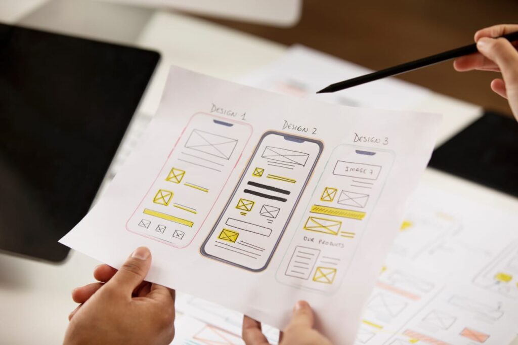
UI (User Interface) and UX (User Experience) design are at the heart of what makes a website successful. They influence how users feel when interacting with your site, and ultimately whether they convert, engage or leave. It must be prioritised to remain competitive, meet customer expectations, and ensure brand loyalty.
Here, we’ve rounded up the top UI/UX design trends in the USA that modern websites are embracing, why they work, and how your business can leverage them for outstanding results.
1. Minimalist & Clean Aesthetics.
This is not just about stripping your site to the bare bones; it’s about doing more with less. Users appreciate clean layouts, generous white space, and carefully chosen typography to help them find what they need quickly. A minimalist design prioritises essential elements— great content, intuitive navigation, and strategic calls to action (CTAs).
Why It Works:
- Enhances readability and user focus.
- Reduces cognitive load, making navigation intuitive.
- Improves load speed and mobile responsiveness.
- Conveys professionalism and modernity.
Lean designs are beneficial for SEO ranking, as they improve load speed and reduce bounce rate.
2. Bold Typography & Expressive Fonts.
Typography is the voice of your brand. With limited copy on landing pages or hero sections, bold and expressive fonts command attention and evoke emotion. They guide the eye naturally through the page, improving navigation and comprehension. Overusing bold fonts can overwhelm users and dilute impact, so use them strategically. Users respond well to a design that feels unique and helps them distinguish headings from body text.
Why It Works:
- Instantly grabs attention and sets the tone.
- Builds brand identity and memorability.
- Improves scannability and content structure.
- Adds visual drama without relying on images.
Optimised fonts with fallback options ensure faster rendering and less layout shift, improving Core Web Vitals.
3. Mobile-First & Progressive Web Design.
Instead of shrinking desktop designs to fit mobile, this approach builds for small screens first. PWAs (Progressive Web Apps) merge website accessibility with app-like functionality. They’re built using modern tech to work on any device and ensure features don’t break core functionality across all screen sizes.
Why It Works:
- Prioritises speed, readability, and one-thumb navigation.
- Emphasises vertical flow, collapsible menus, and touch-friendly elements.
- Boosts SEO, especially since Google’s indexing is mobile-first.
- Offline access and push notifications.
Responsive websites are favoured by search engines and essential for local searches—a critical factor for businesses targeting mobile-friendly web development in the USA.
4. Voice & Gesture-Enabled Navigation.
With the growing adoption of smart assistants and touch gestures, users are seeking more natural ways to interact with websites. Voice navigation empowers users to speak commands like “search reviews” or “open cart.” Gestures enable motion-based control, such as swiping or pinching to zoom.
Why It Works:
- Enables hands-free interaction.
- Uses natural human inputs: speaking, swiping, and waving.
- Opens doors to zero UI designs, where screen fade and experience become seamless.
- Expands usability, simplifies tasks and brings tech into everyday life in intuitive ways.
Voice-enabled search supports featured snippets and voice search traffic. These interfaces remove traditional input in favour of natural user interaction.
5. Dark Mode Support.
When designed intentionally, dark themes look sleek and modern. Smart designs allow users to toggle themes, often storing preferences via cookies or OS settings. Many users value eye strain reduction and battery savings (especially mobile users) as it respects preferences and adds sophistication to the interface. It’s all about choice and increasing comfort.
Why It Works:
- Reduces eye strain during nighttime or long browsing sessions.
- Conserves battery life, especially on OLED screens.
- Gives users control over their environment—people love customisation.
Positive UX from dark mode support can decrease bounce rate, which is a plus for SEO performance.
6. Scrollytelling & Interactive Narratives
“Scrollytelling” refers to storytelling through scroll-triggered animations and content reveals. It’s a trend that blends narrative, visuals, and interactivity to guide users through a journey. It’s often used for product launches, campaigns, or About pages. It turns a passive browsing session into a guided brand experience that holds attention longer.
Why It Works:
- Ensures users stay longer, engage more deeply, and better remember your story.
- Turns static content into a cinematic experience.
- Make users part of the narrative rather than passive observers.
- Creates emotional investment in the message or brand.
Compelling interactive content can increase the likelihood of backlinks.
Is Your Website Ready for the Future?
Trends come and go, but the principles behind good UI/UX design remain constant: clarity, simplicity, and user empowerment. In the USA and beyond, modern websites are no longer just brochures but dynamic, responsive tools for driving growth.
BoznG specialises in crafting SEO-friendly and visually stunning digital experiences tailored to your market. Whether you’re a startup in Toronto, an enterprise in Berlin, or a boutique agency in Barcelona, let’s bring your vision to life.
To get started, contact us at bozng.com.