
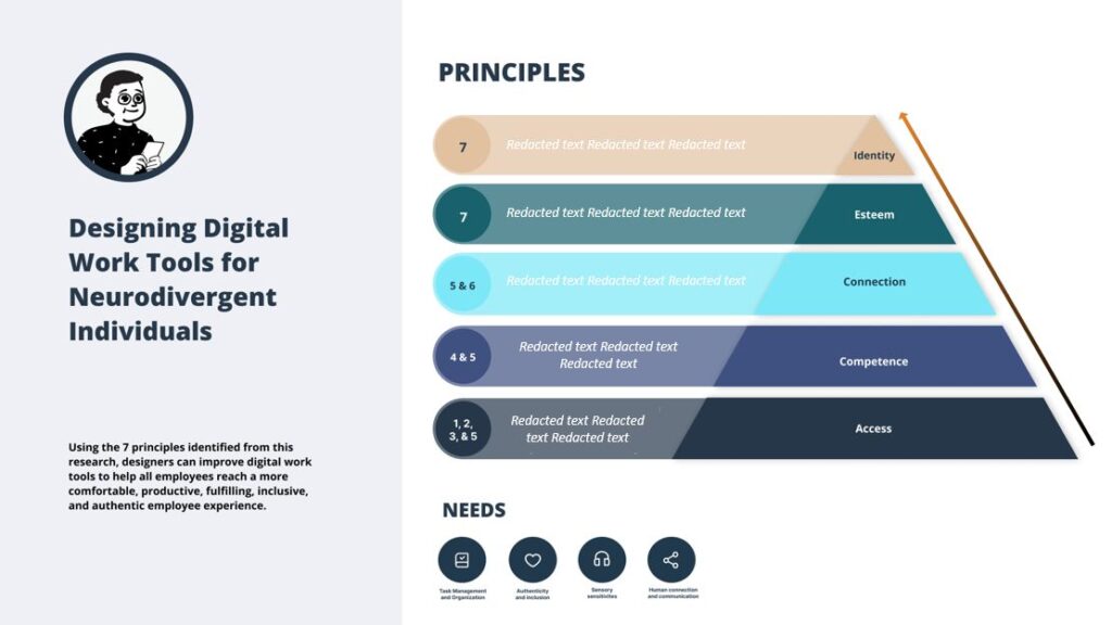
Accessibility in digital design often focuses on visible or physical barriers, such as colour contrast, screen readers, and keyboard navigation. Those efforts matter. Yet they leave an entire dimension underserved: cognitive accessibility. A user with ADHD or autism can meet a visually “accessible” site and still struggle to process it because of overwhelming layout, jargon, motion, or unpredictable interactions. To create truly inclusive experiences, designers must intentionally build for diverse cognitive styles.
Why Cognitive Accessibility Matters
Cognitive accessibility refers to a design that accommodates how people think, focus, understand, and navigate information. Conditions like ADHD (Attention-Deficit/Hyperactivity Disorder) and autism influence how users pay attention, filter sensory input, and process instructions. These traits shape online experience as deeply as visual or motor differences do.
A traditional UX approach often assumes everyone interacts with a product the same way. It prioritises convention over predictability and compliance over clarity. That model fails many neurodivergent people. When a site presents too much information to a user at once or forces them to guess what will happen next, cognitive overload spikes, and the experience breaks down.
Understand ADHD and Autism in the UX Context
Before building solutions, designers must grasp relevant traits.
ADHD often brings difficulty sustaining attention, shifting focus abruptly, and juggling working memory — the ability to hold and manipulate information in mind. These traits make long, undifferentiated content and unexpected interactive transitions especially hard to follow. Everyday tasks, such as completing a form or learning a new interface, can feel like climbing a steep hill.
Autism, meanwhile, can involve sensory sensitivity, a preference for routine, and challenges with ambiguous instructions. Sudden sounds, high-contrast flashing elements, or unclear navigation can distract, frustrate, or even trigger anxiety. Predictable experiences with minimal surprises help autistic users feel grounded and in control.
Both sets of needs are diverse and unique to each individual. There’s no single “ADHD experience” or “autism experience,” but there are shared patterns that good UX can address.
Core Principles of Neuro-Inclusive UX
Prioritise Clarity and Simplicity
Clear language, direct instructions, and focused content help users process information without guesswork. Designers should present one idea at a time and avoid technical jargon. Everyday phrases such as “Sign in” beat “Authenticate your credentials” because they map directly to user intentions.
Text should break naturally into short, digestible pieces. Use headings that tell users exactly what comes next, not vague themes. For neurodivergent users, every sentence should earn its place because every distraction costs extra attention.
Structure Navigation with Predictability
Chaos kills focus. Neurodivergent users often benefit from layouts and menus that behave like a well-organised roadmap. Keep navigation consistent across pages. Never move key actions or controls unexpectedly between screens. Use descriptive, literal labels so users know what happens when they engage a button or link.
Breadcrumbs, progress indicators, and flat hierarchies (fewer nested menus) reinforce orientation. When people know where they are and how they got there, they stay engaged rather than lost.
Reduce Cognitive Load Through Visual Design
Cognitive overload happens when a user encounters too much information or too many choices at once. It creates frustration and errors. Designers must craft visual hierarchies that gently guide attention toward the most important elements first.
Whitespace isn’t wasted space — it’s a breathing room that lets brains organise information. Group related items together so users don’t have to hunt for what they need next. Too many buttons, sudden highlights, or competing visuals make it harder to focus.
Minimise Sensory Overload
Autistic users often experience stronger reactions to sensory input. Bright, flashing, or jolting elements can distract, startle, or disorient. Avoid auto-play audio/video. Never trigger motion without user consent. Keep animations smooth and purposeful rather than decorative.
Colour and contrast matter beyond aesthetics. High contrast can improve readability, but extreme combinations (like pure black on stark white) can feel harsh. Softer contrasts and customizable themes empower users to choose what feels comfortable and calming.
Support Attention and Memory
Users with ADHD may leap ahead, forget essential steps, or misinterpret a sequence. UX must support memory and focus without forcing users to remember too much at once.
Break multi-step tasks into clear, sequential blocks. Indicate progress clearly. Allow users to pause and resume tasks without losing their place. Provide undo options for destructive actions. These design choices reduce anxiety and help users maintain momentum.
Allow Customization and Autonomy
Neurodivergence isn’t a monolith. Users have different triggers, preferences, and needs. When possible, let them control their experience. Adjustable text sizes, contrast settings, reduced motion toggles, and distraction-free modes let individuals tailor the interface to their strengths.
This approach shifts accessibility from compliance to autonomy. Instead of guessing what’s “best” for everyone, designers let users take the wheel. A customizable comfort mode makes interfaces genuinely inclusive without compromising aesthetics or brand identity.
Testing With Real Users Matters Most
No UX strategy succeeds without validation. Designers too often rely on assumptions rather than real feedback from neurodivergent users. Observing how actual users interact with prototypes reveals pain points that standards and checklists miss.
Include people with ADHD and autism in usability studies. Ask them where they struggle. Watch where their attention drifts. Build your product around their insights, not just generalisations. Only then will your design truly solve the problems it intends to address.
Common Pitfalls to Avoid
Some design choices look harmless but create real barriers:
- Hidden steps in a flow that require guessing what comes next.
- Flashy animations that draw attention away from core tasks.
- Ambiguous labels like “Continue” or “Next” without context.
- Excessive clutter that forces users to scan too much before acting.
- Auto-play media that interrupts focus unexpectedly.
Each of these choices demands extra effort from the brain. When design forces users to think about the interface, it takes away their ability to think about the task they came to complete.
Designing With Humanity
Designing for neurodivergence isn’t a niche add-on. It elevates usability for everyone. When a product simplifies cognitive load, controls sensory input, and respects user autonomy, it becomes more welcoming, effective, and inclusive. That means less frustration, fewer errors, and more people, regardless of cognitive style, succeeding at what they set out to do.
Build with empathy. Test with intention. Let people guide you. When design is centred around real human variation, accessibility stops being a checklist and starts being a practice that truly works.