
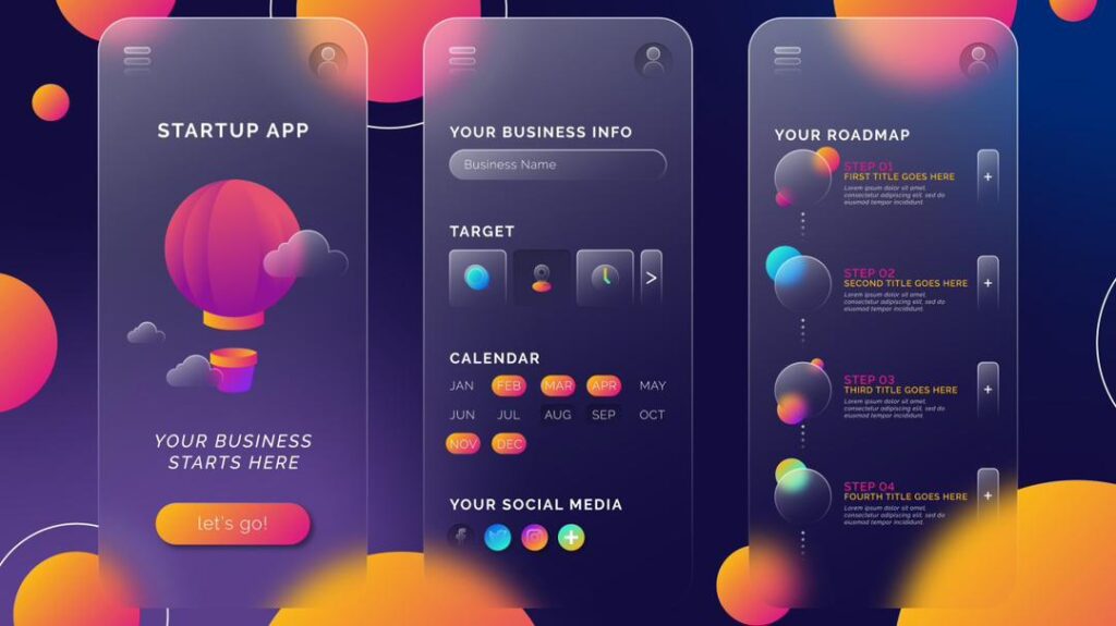
In 2025, digital design reached a tipping point. Designers no longer chase aesthetics alone. They now pursue meaningful motion, expressive interfaces, and visceral user experiences that communicate system intelligence as clearly as functionality. At the heart of this shift is Glassmorphism 2.0. This is an evolution of the classic frosted-glass UI trend, now reimagined to show users that AI is thinking, working, and responding in real-time.
Glassmorphism itself first swept the design world by introducing semi-transparent layers, subtle blurs, and floating panels that added depth without clutter. These qualities gave interfaces a refined, modern feel that designers and users alike. Its presence grew so prominent that by 2025, many mainstream products integrated glass-like elements into dashboards, menus, and overlays to elevate clarity and hierarchy. Designers championed the effect for creating dimension without sacrificing minimalism.
Today, designers push this aesthetic even further. They fuse glass effects with dynamic feedback systems that respond to AI activity — creating what we call AI “Glow” Interfaces, or Glassmorphism 2.0. Beyond aesthetic polish, these interfaces signal cognitive action, helping users understand what’s happening behind the scenes.
From Static Blur to Intelligent Feedback
Traditional glassmorphism appealed because it gave digital interfaces a sense of space and light. The blurred, translucent layers felt open and elevated compared to flat design. But as AI moved from novelty to baseline feature, static visuals no longer matched users’ expectations. People want to feel that an AI is working — not just see spinning loaders or frozen indicator bars.
Glassmorphism 2.0 solves this by combining semi-transparent surfaces with contextual animations and glow effects that signal AI processing. Instead of a static card that simply looks pretty, elements breathe, pulse, and radiate. A subtle glow becomes a non-disruptive yet informative cue that computation happens below the surface.
Think of an intelligent assistant composing a response: the interface doesn’t just wait. It glows. A panel softly brightens and dims, hinting that the AI is “thinking,” much like how a human pauses before they speak. When the process completes, the glow recedes, and results snap into view. This communicates tempo and activity level without interrupting the user experience.
The Visual Language of AI Activity
Glassmorphism 2.0 hinges on creating meaningful visual languages that go beyond static backgrounds or decorative design. At its core, it uses semi-transparent layers amplified by motion and luminance to tie interface behaviour to AI processes.
At the earliest stage of interaction, when a user triggers an AI action, background panels subtly brighten. Motion rarely feels abrupt. Instead, designers opt for organic, rhythmic pulses that map to computing intensity — slower waves for routine tasks, stronger pulses for heavier processing. The interface feels alive, ever aware of what’s happening under the hood.
Color plays a powerful role. Cool tones, such as soft blues or violet glows, hint at calculation and reasoning. Warm highlights signal completion or attention required, guiding users emotionally as well as visually. These palettes don’t feel arbitrary. They reflect how humans associate colors with emotions and states, turning abstract AI processes into something intuitive and human-readable.
This trend builds on the foundational principles of glassmorphism — semi-transparent surfaces and layered depth — but pushes designers to think in terms of system feedback instead of pure decoration. The result feels expressive without overwhelming.
Why This Matters for AI Interfaces
AI interfaces present a unique challenge: users must constantly infer what’s happening behind layers of computation that remain invisible without clear signals. Load spinners and progress bars have limits. They tell you something is loading, but they don’t connect emotionally or cognitively with users. They remain cold and static.
Glassmorphism 2.0 does more.
It transforms waiting into experience. Users don’t just know that AI is working; they feel it. A gentle glow becomes a bridge between human perception and algorithmic activity. People are no longer left staring at a blank screen or generic loader. They watch their interface transition, breathe, and respond, reducing anxiety during wait times while reinforcing trust in the system.
This matters not just aesthetically, but functionally. Users feel more engaged and less frustrated when interfaces communicate progress in ways that feel alive and reassuring. Interfaces become partners in the interaction rather than silent machines.
How Glassmorphism 2.0 Shapes Practical UI Design
Implementing Glassmorphism 2.0 goes deeper than applying CSS blur filters or layering cards. It demands intentional design decisions where every visual choice corresponds to a UI state or an AI event. At its best, this style reveals inherent system logic through elegant interaction.
The classic traits of glassmorphism — frosted translucency, layered hierarchy, and soft shadows — remain foundational. Designers now layer motion on top of these qualities, making blur and glow change dynamically as users interact. If AI is synthesising a summary, the panel might emit a slow, calming pulse. If the system grasps urgency or confidence shifts, the glow can subtly intensify or soften.
Interactivity extends beyond visual feedback. Some implementations adapt surfaces based on user behaviour. If a user hesitates or lingers, the glow might decrease to signal idle AI or build to prompt continued interaction. Interfaces feel alive not because of random motion, but because they respond to context and state.
Achieving this requires collaboration between design and development. Techniques like CSS backdrop filters, GPU-accelerated animations, and frameworks that support state-driven motion are essential. Designers must work closely with engineers to balance responsive visuals and performance constraints, ensuring effects enhance rather than degrade usability.
Balancing Beauty with Accessibility and Performance
Innovative visual language should include usability, not compromise it. Glassmorphism 2.0 faces the same challenges that early glassmorphism did. Too much transparency or motion can hurt readability, distract users, or strain low-power devices.
Designers must respect accessibility preferences. Some users find constant motion or a vibrant glow distracting. Interfaces should offer reduced motion options, clear colour contrast, and fallback styles that preserve meaning without ornamentation. Performance remains critical, especially on mobile devices where GPU resources are limited. Thoughtful implementation ensures elegance doesn’t come at the cost of speed or clarity.
Looking Ahead: Interfaces That Feel Intelligent
Glassmorphism 2.0 represents more than a trend. It marks a shift in how designers conceive of UI — not as static containers for information, but as living layers that communicate intent and action. As AI grows more sophisticated, interfaces must evolve to reflect that intelligence in ways users intuitively understand.
Future designs may blend glow languages with adaptive AI that learns from emotional cues or stress levels, adjusting visuals to support calm or focus. Interfaces could gently shift their appearance based on user context — time of day, task urgency, or cognitive load — making every interaction feel personalized and alive.
In this future, UI becomes more than paint on glass. It becomes a dialogue partner between user and machine, revealing internal logic through thoughtful motion, luminous depth, and empathetic feedback.
Conclusion: Designing for AI’s Invisible Logic
Glassmorphism 2.0 doesn’t reject the clean elegance of its predecessor. It amplifies it. By weaving dynamic glow, motion logic, and semi-transparent depth into AI interfaces, designers make invisible processes visible in feeling, not noise. Users don’t just consume AI — they experience it.
In a world where AI permeates everyday apps, this shift matters. Interfaces that communicate system intelligence with beauty and clarity don’t just look futuristic — they feel human.