
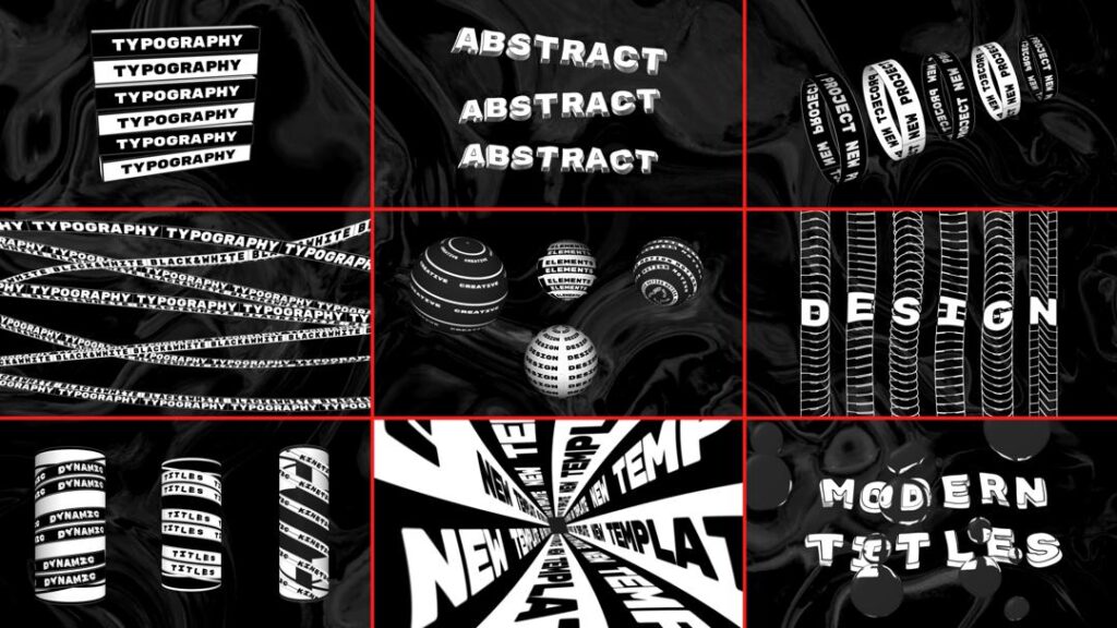
From silent, static text blocks to dynamic type that dances, reacts, and responds, typography has transformed into something alive. Designers and digital storytellers no longer treat text as a silent messenger. Today, words move, sway, bounce, and react as users scroll, hover, or speak. This revolution in typographic design places interaction and motion at the core of communication. The result? A new visual language that increases engagement, enhances UX, and transforms how audiences connect with content.
A New Dimension for Words
Traditional typography lived on the printed page. Letterforms sat still, waiting for readers to interpret them. Digital screens changed that. With computing and motion graphics, designers unlocked a new dimension: time. Typography now moves across space and time, letting text behave like actors in an interactive performance. This “living” text marks a dramatic shift in design thinking — text no longer merely informs but interacts.
Kinetic typography originally grew from animation and film. Saul Bass’s groundbreaking kinetic title sequences for Alfred Hitchcock’s North by Northwest in 1959 are widely recognised as early landmarks in type animation. Those opening credits didn’t just list names — they set a mood and hooked viewers immediately.
Once confined to cinematic sequences and title design, kinetic typography now shapes user interfaces, websites, apps, and interactive media. It responds to user behaviour, creating dynamic experiences rather than static pages. That shift reflects larger trends in UX design, where interfaces adapt and listen to users rather than passively display content.
What Kinetic Typography Really Means
At its core, kinetic typography means motion with purpose. It combines motion design with typography so that text itself becomes dynamic rather than static on a page or screen. Designers harness motion to guide attention, reveal meaning, express emotion, and make content memorable. This technique goes beyond simple animation for effect; it transforms text into an interactive layer of communication.
In practical use today, kinetic typography can vary from subtle to dramatic. On one interface, a headline might smoothly slide into view as users scroll. On another, characters might expand and contract based on cursor movements. In voice-interactive systems, text may react or animate in sync with spoken commands. Each movement carries intention and enhances user engagement.
Why Static Text Is Losing Its Power
People no longer see content the way they once did. The rise of digital interfaces and social media has shortened attention spans. Users flick through pages, skim information, and decide within seconds whether to stay or go. Static text struggles to hold attention in this fast-paced landscape.
Designers have recognised that movement grabs the eye instinctively. When text animates, it becomes easier to notice and remember. At its best, kinetic typography makes reading an active experience rather than a passive one. Text doesn’t just sit there; it responds, reveals, and guides.
Scrolling has become a universal user behaviour. And so, designers now treat scroll actions as signals. Instead of being passive actions, scrolls trigger text effects that reveal new information dynamically. Kinetic typography turns scrolling into storytelling rhythm. Each scroll becomes a cue for text transformations that deepen engagement.
Hover and cursor interactions add another layer of responsiveness. By animating text on hover, designers provide immediate feedback and satisfy user curiosity with motion that feels intuitive and alive.
Voice input pushes this further. As users speak to interfaces, text can animate in real time, reflecting presence, pacing, and tone. This alignment between voice and visual text elevates interaction beyond reading — it becomes a conversation.
The Mechanics Behind Living Typography
Kinetic typography operates where motion design meets interaction design. At a technical level, designers combine CSS animations, JavaScript, and motion libraries to animate text elements subtly or boldly. Modern tools, such as variable fonts, allow designers to animate properties like weight and width smoothly, giving text a fluid quality that was impossible a decade ago.
Principles of motion include timing, easing, and pauses. Just like good speech, text needs rhythm. Designers use easing curves to create natural movement, helping type appear to accelerate or slow in a way that feels organic. Even small text movements matter. A brief fade-in or slide up can cue users to new content without distracting from reading.
Simultaneously, performance considerations play a crucial role. Heavy animations can slow page load times and frustrate users. Designers optimise kinetic text with lightweight code and focus on meaningful rather than excessive motion. Ensuring that typography performs well across devices — especially mobile — remains a priority.
The UX Psychology of Moving Text
Humans process motion instinctively. Our brains react quickly to changes in visual input. Designers exploit this by using moving text to guide attention. A headline that subtly moves into view naturally attracts the eye before surrounding static elements.
Motion also carries emotional weight. Text that bounces, expands, or pulses conveys personality and tone. A soft bounce might suggest friendliness or playfulness, while a strong slide-in could convey confidence or urgency. Motion becomes part of the message itself.
When movement pairs with storytelling, retention increases. Animated text that reveals content like chapters in a story helps users absorb information more deeply. Our brains construct narratives more easily when motion cues align with textual content — a blend of rhythm and story that feels natural and compelling.
Where Kinetic Typography Shines in the Real World
Kinetic typography appears across countless modern interfaces and media. Many brands use motion type on landing pages to capture attention instantly. Major technology companies animate headlines during product launches to build anticipation and reinforce brand identity. Subtle animated CTAs encourage interaction by guiding the eye to take action.
In educational content and explainers, dynamic text helps break down complex ideas. Rather than overwhelming users with static paragraphs, designers reveal text in stages with motion that matches logic and pacing. This narrative pacing turns reading into an immersive experience.
Interactive websites often leverage responsive typography. As users scroll, block text shifts, rotates, or fades to reveal new sections, encouraging exploration and discovery. Text becomes a partner in exploration, not just an information source.
Balancing Motion with Usability and Accessibility
Motion adds excitement, but it also presents challenges. Poorly executed kinetic typography can overwhelm users and distract from meaning. Excessive animation may create cognitive overload or confuse users who expect static reading content. Designers must strike a careful balance.
Accessibility matters. Some individuals find motion uncomfortable or distracting, particularly users prone to motion sensitivity. Best practices now include offering reduced-motion options and ensuring that animated text remains readable and controlled.
Performance is equally essential. Animations should load quickly and avoid lag, especially on mobile networks. Lightweight techniques — such as CSS transitions instead of heavy JavaScript — ensure that motion enhances rather than hinders experience.
The Future: Interactive, Intelligent Typography
Looking ahead, kinetic typography will only grow more interactive and intelligent. Integration with AI could enable text that adapts in real time to user behaviour, context, or even emotional cues. Voice and gesture controls will extend the responsiveness of typography beyond mouse and scroll, making text react like a living interface.
Designers will continue to explore fluid and organic motion, blending kinetic type with immersive interfaces like AR and VR. In these environments, text may occupy physical space, responding to head movement and gestures to engage users in entirely new ways.
Conclusion
We live in an era where screens replace still pages, and motion transforms meaning. Kinetic typography stands at the intersection of design, interaction, and storytelling. Static text no longer satisfies the visual demands of users. Today’s audiences expect living letters — words that move, respond, and engage.
When designers harness motion thoughtfully, kinetic typography does more than decorate. It draws users into content, reinforces brand voice, and enhances comprehension. As technology continues to advance, living letters will become even more vital to how we design experiences and connect with audiences.