
Scrolling changed how people tell stories on the web. Designers no longer hand readers a static page; they guide readers through time and space, choreographing visual depth, motion, and tiny responsive touches to shape meaning. When designers combine parallax depth with purposeful micro-interactions and a psychology-first structure, scrolling stops being a simple navigation action and becomes a narrative engine. This article explains why scroll-telling works, how the brain responds to motion and interaction, and how you can design scroll journeys that feel inevitable, engaging, and humane.
So, Scrollytelling Matters?
Yes, absolutely! People consume stories differently on the web. They skim, dip in and out, and react to immediate feedback. Scrolling acts like a soundtrack: it sets tempo, cues attention, and structures revelation. Because the scroll sits inside a familiar motor routine (flick, swipe, wheel), designers can map narrative beats to movement. That mapping becomes especially powerful when parallax creates perceived depth and micro-interactions deliver immediate, bite-sized feedback. Together, they shape memory, emotion, and flow if designers anchor them to cognitive principles instead of mere decoration. ResearchGate shows parallax and layered motion increase perceived immersion and fun in hedonic contexts, and they influence where people look and what they remember.
Core Psychological Drivers of ScrollyTelling.
Attention and sequencing
Scrolling turns information into a temporal sequence. The human brain excels at making sense of sequences. It predicts the next beat, compares expectation with outcome, and files surprises as salient memories. Designers can harness that predictive machinery by using clear visual hierarchy and motion to mark the story’s milestones so users process each beat quickly and know what to expect next. The Interaction Design Foundation recommend progressive disclosure—delivering the right amount of information at the right moment—to reduce overwhelm and keep curiosity active.
Cognitive load and progressive disclosure
Cognitive load theory translates directly into scroll design. The brain holds a limited amount of information in working memory, so when the interface floods the user with unnecessary options or competing motion, comprehension falls apart. Structure the scroll like a conversation: present a single idea, let the user digest it, then reveal the next. Progressive disclosure reduces extraneous cognitive load, highlights schematic elements that support learning, and prevents the scrolling experience from feeling frantic or exhausting.
Embodied cognition
Embodied cognition argues that bodies shape minds. When users physically scroll, they enact the narrative that motor action ties directly to how they feel about the content. A slow, deliberate scroll invites reflection; a quick flick signals scanning. Designers can leverage embodied responses by aligning motion cues and semantic content, for example, slow reveal for emotional beats or quicker motion for transitions, so the user’s body and the story reinforce the same interpretation. UX Collective increasingly frame experience as embodied and actionable, not merely representational.
Reward, micro-feedback, and habit formation
Tiny responses, such as the micro-interaction that bounces, blinks, or confetti-bursts, immediately shows that the system recognized the user. The brain rewards that evidence with short bursts of dopamine to reinforce the behavior and make the interface feel reliable and pleasurable. Use those micro-rewards strategically by confirming progress, celebrating completion, and pacing them so they don’t lose meaning. Veroke.com trace the link between micro-feedback and sustained engagement as small, well-timed rewards to keep people moving through narrative arcs.
Parallax as a storytelling engine
Now, what does parallax actually buy you?
Motion parallax arises when foreground elements move faster relative to background elements, and the visual system interprets that difference as depth. In storytelling, that depth becomes a semantic tool where foreground elements feel urgent, and background elements feel contextual or historical. Designers can make use of those spatial relationships to prioritize information and create emotional distance or proximity. Close-up elements would feel intimate; distant layers would feel reflective. This demonstrate how parallax alters depth perception and boosts perceived immersion when designers use it with intent.
Parallax as cueing and pacing
Use parallax to cue narrative beats rather than as surface ornamentation. When the foreground accelerates to reveal a data visualization or slows to reveal a quote, the motion functions like a punctuation mark. Parallax also controls pacing: staggered layers let you elongate or compress perceived time without changing actual scroll speed. That trick gives you fine control over the reader’s emotional arc—build tension visually, then release with a plain, steady scene to let the idea sink.
Practical constraints and accessibility
Parallax creates charm, but it also risks motion sickness or confusion. Users with vestibular sensitivity or cognitive disabilities may find layered motion disorienting. Respect system preferences—honor prefers-reduced-motion—and never make critical content rely solely on motion. Use parallax where it adds semantic meaning and provide static fallbacks. DIVA Portal shows that parallax works best in hedonic contexts when it supports the story rather than competes with it.
Micro-interactions
Micro-interactions are the architecture of small moments, doing three important things: giving feedback, guiding behaviour, and emotionally colouring the narrative. When you like a photo and the heart reacts, the interface tells you, “I got that.” When a section title subtly animates into place, the interface cues you to read. Those small acts of confirmation increase perceived control, which increases trust and willingness to continue. UX practitioners consistently show that small, clear feedback reduces anxiety and increases completion rates.
Timing, easing, and meaning
Timing matters. A 150–300 ms micro-animation feels responsive without being obtrusive. Use easing functions to mimic physical systems—elements that decelerate feel heavier; those that snap feel mechanical. When a micro-interaction mirrors the story’s tone, it amplifies the emotional meaning. For example, a subtle paper-like curl that accompanies a nostalgic passage reinforces the theme; a crisp pixelated effect suits a retro or technical section. Establish a movement language early and reuse it so interactions accumulate meaning.
Make micro-interactions earn their keep
Reserve micro-delight for moments that deserve reinforcement—achievements, pivots, and choices. Overuse dilutes their power and increases cognitive load. Keep them discoverable but optional; let users move through the narrative even if they ignore the flourishes.
Practical workflow for designing a scroll narrative
Start with the story, not the effect
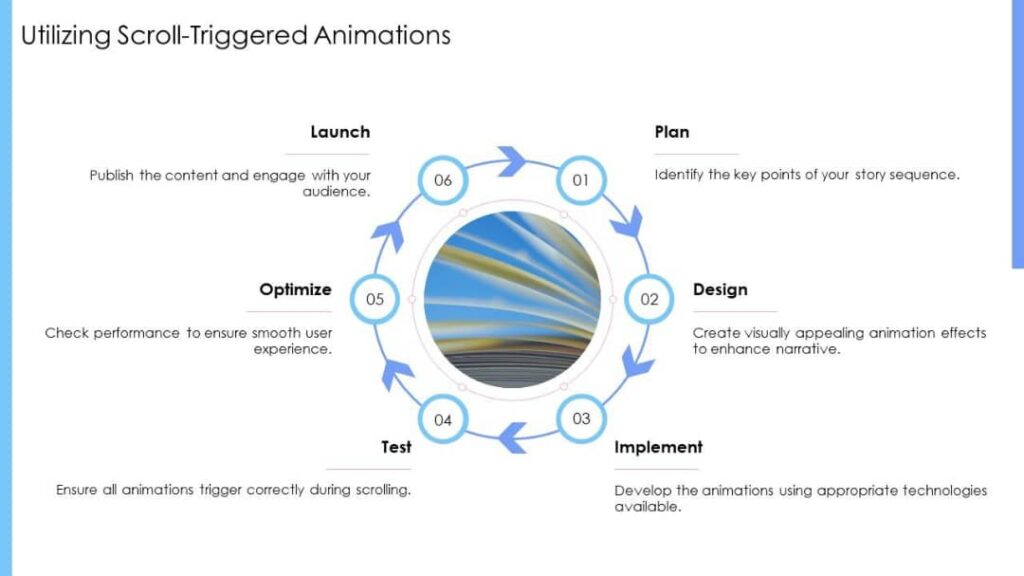
Define the arc in plain language: what is the beginning, the turning point, the climax, and the resolution? Write those beats as micro-scripts that map onto scroll positions (for example: 0–25% = set up; 25–60% = rising action; 60–85% = climax; 85–100% = denouement). Designers who start with a story avoid shiny but meaningless motion.
Wireframe with pacing in mind
Sketch screens as storyboard frames and mark where parallax layers will give meaning versus where micro-interactions will reward action. Aim for one major parallax moment per narrative act and sprinkle micro-interactions to confirm user choices or progress.
Build the movement language
Choose a small palette of easings, durations, and motion types (translate, scale, opacity, parallax shift). Use those consistently to create rhythm. Document the language as part of the design system so developers and motion designers stay aligned.
Prototype and test with users
Prototype interactions early and test with real people. Observe scroll speed, hesitation, confusion, and whether viewers notice key beats. Watch for vestibular discomfort and ask users whether motion supported meaning or distracted from it. Iteration here beats polish: a clumsy interaction that confuses harms narrative flow more than a simple, clear interaction.
Respect performance and progressive enhancement
Parallax and micro-interactions tax devices. Prioritize performance: reduce paint/layout thrashing, use transforms and opacity (GPU friendly), and degrade gracefully on low-power devices. Load heavy assets after the critical narrative path so the first meaningful content appears quickly.
Case studies
Snow Fall — an encounter design milestone
When The New York Times published “Snow Fall” in 2012, journalists and designers treated it like a new grammar for web narrative. The story combined longform text with integrated multimedia, smooth transitions, and visual beats that aligned with narrative shifts. Analysts later deconstructed “Snow Fall” as a pivotal example of interactive narrative—one that showed how multimedia and motion can heighten comprehension, empathy, and memory when designers coordinate media and pacing deliberately.
The Boat — an interactive graphic novel that respects sensing
SBS’s “The Boat” blends illustration, sound, scroll choreography, and micro-interaction to create an emotionally dense reading experience. Developers engineered subtle transitions, sound cues, and layered visuals that emphasize character proximity and narrative weight without overwhelming the reader. The Boat demonstrates how narrative intimacy benefits when designers orchestrate motion, audio, and micro-feedback to support, not overshadow, the story.
Testing for emotion and comprehension
Designers often default to usability metrics (time on page, bounce) that tell only part of the story. Use mixed methods to evaluate narrative scrolls:
- Observational testing: watch how people scroll, where they pause, and what they re-read.
- Cognitive interviews: ask users to recount key beats—this reveals whether motion conveyed intended meaning.
- Physiological signals: when appropriate and ethical, measure pacing and arousal (e.g., galvanic response) to test emotional peaks.
- Analytics with event mapping: instrument scroll milestones, micro-interaction triggers, and conversions—but interpret numbers in light of qualitative feedback.
You must optimize for both comprehension and delight. A long dwell time can mean confusion as much as engagement; triangulate signals.
Accessibility, ethics, and inclusive design
Motion and interactivity carry ethical responsibility. Motion can physically harm people with vestibular disorders. Surprise animations can trigger anxiety. Always provide controls: respect prefers-reduced-motion, allow users to pause autoplayed audio, and ensure keyboard accessibility and screen-reader friendly content. Make meaning available without motion; motion should enhance, not replace, essential information.
Also think about persuasion. Micro-rewards can push behavior; use them to help users (confirmation, progress), not to manipulate (dark patterns that trick users into subscriptions or purchases).
Common pitfalls and how to avoid them
- Motion without meaning: Don’t animate because you can. Each parallax or micro-interaction must support a narrative function.
- Overcrowded motion: Too many competing moves confuse attention. Limit motion channels and stagger beats.
- Unpredictable interaction: If users cannot predict how the interface will respond, they hesitate. Keep interaction affordances clear and consistent.
- Performance regressions: Test on low-end devices. Smoothness matters as much as the idea.
- Neglecting fallbacks: Always provide static, accessible alternatives for users who opt out of motion.
Looking ahead for trends that matter
Designers will increasingly pair machine learning with scroll narratives, creating adaptive journeys that respond to user behavior and context in real time. Biometric inputs might tailor pacing and sensory intensity. At the same time, the field will emphasize ethical guardrails and inclusivity: as designers push interactivity forward, people will demand predictable, respectful experiences that preserve agency.
Checklist for producing a psychologically sound scroll story
- Define the narrative arc first; map it to scroll positions.
- Use parallax for semantic depth, not decoration.
- Reserve micro-interactions for feedback and milestones.
- Prototype early; watch real users scroll.
- Honor prefers-reduced-motion and test for vestibular safety.
- Instrument meaningful events and pair analytics with qualitative tests.
- Optimize for low-end devices and progressive enhancement.
Conclusion
Scroll-telling merges narrative craft with sensory design. When you design with the brain’s primitives, such as prediction, motor feedback, attention, and reward, you turn scrolling into a meaningful journey. Parallax gives the story spatial weight; micro-interactions give readers proof that the story notices them. Use both sparingly, deliberately, and ethically. Tell fewer effects, tell clearer beats, and let the scroll itself become a companion in the story.