
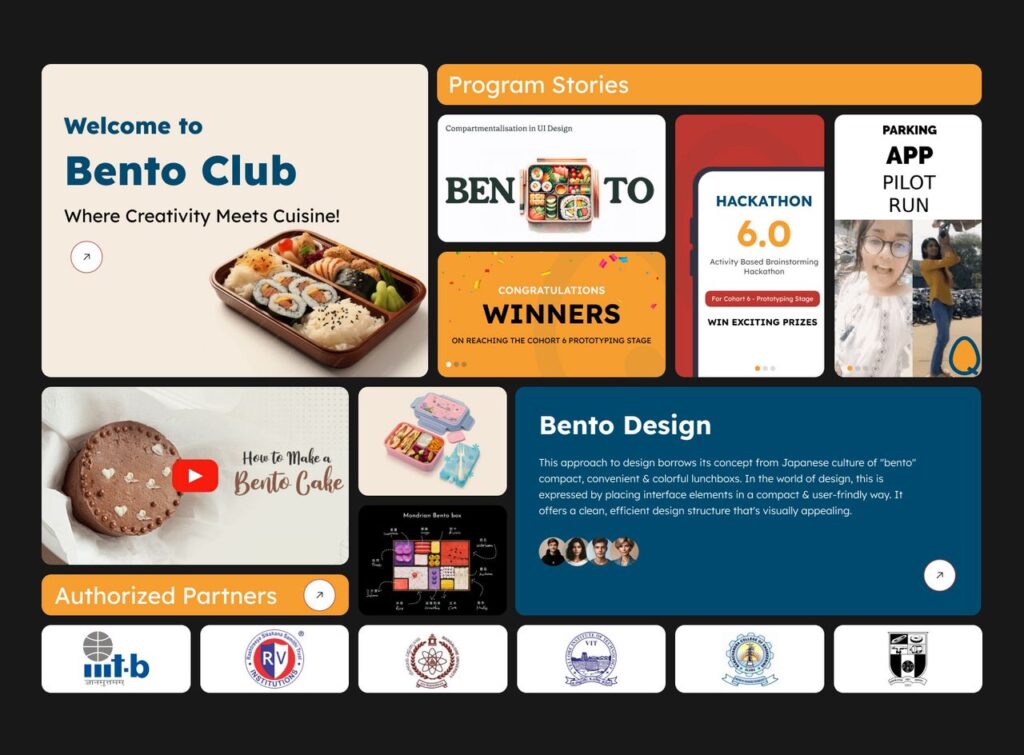
Design evolves when it solves real human needs in elegant ways. In 2025, one of the most talked-about layout styles in digital interfaces is the Bento Grid—a modular, card-based system that balances aesthetics, usability, and flexibility. You’ll see it everywhere: from SaaS dashboards and data analytics panels to creative portfolios and landing pages. What makes this trend so powerful is how it turns complexity into clarity, much like the culinary art of the Japanese bento box from which it draws its inspiration.
Why Bento?
This design philosophy is rooted in simplicity and structure. The term “Bento Grid” originates from the Japanese bento box, a compartmentalised lunch container that keeps foods separate yet visually harmonious. Each compartment serves a purpose and holds a distinct item, yet the whole feels balanced and intentional. In UI design, this translates into layouts where the interface divides content into distinct, visually comfortable blocks that guide the eye without overwhelming it.
The beauty of this model lies in its clarity. Designers use varied tile sizes and positions to create a hierarchy—larger tiles for key metrics and smaller ones for details. This mimics how we naturally scan screens: starting with the big picture and then narrowing in on specifics.
From Lunchboxes to Screens
There’s no single birthdate for Bento UI, but its aesthetic roots connect to longstanding design principles and historic UI experiments. Some observers trace its visual roots back to Microsoft’s Metro design language, which used block-like tiles to organise app content. Others point to Apple’s product showcase layouts in Mac and iOS presentations as a more recent and influential example of Bento layouts in action.
What both influences share is a commitment to modular clarity. They emphasise grouping related elements into self-contained units that users can quickly scan, comprehend, and interact with. This tradition fits naturally into the way people browse digital screens today, especially when attention spans are short and tasks are complex.
How Bento Grids Work
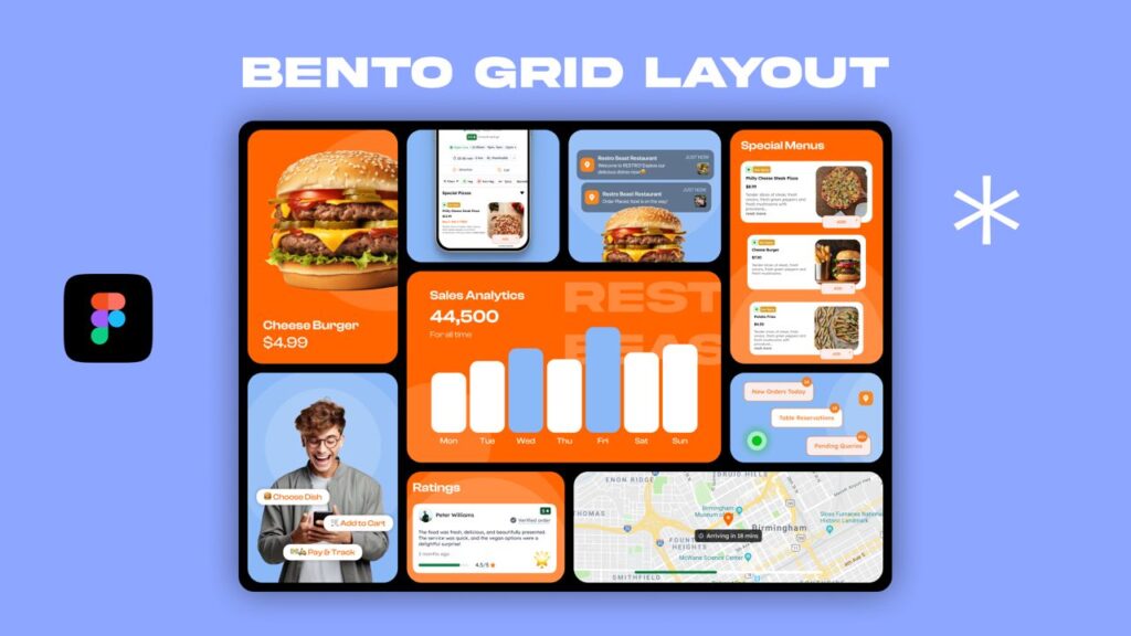
At its core, a Bento Grid is a flexible two-dimensional layout composed of card-like sections of varying sizes. Designers arrange these sections to create a visual rhythm and hierarchy across the screen. The larger areas immediately draw attention, while smaller segments support and organise secondary information.
This design uses three key principles:
- Modularity: Each card stands on its own visually and functionally. You can rearrange, add, or remove cards without breaking the entire layout.
- Visual Hierarchy: Size, placement, and even subtle motion cues help guide users through what’s most relevant first.
- Responsiveness: Bento grids flex naturally to different screen sizes. On mobile, cards often stack into a single column for seamless readability.
What you get is not just a layout, but a thoughtful journey through content.
Where You See Bento UI Today
The Bento Grid has moved quickly from experimental novelty to practical mainstay in many digital spaces:
- Dashboards: It organises key performance indicators, charts, notifications, and controls into digestible blocks. Analysts can find data quickly without sifting through tables or dense paragraphs.
- Portfolios: Creatives use Bento layouts to present work in dynamic, homepage-style canvases. The varied tile sizes help emphasise flagship projects without cluttering lesser pieces.
- Landing Pages: Product and service pages use Bento sections to highlight features, benefits, testimonials, and calls to action in a visually curated flow.
- Web Apps & Widgets: Mobile interfaces, with limited screen real estate, benefit from the intuitive stacking behaviour and quick scanning that Bento patterns support.
Across uses, designers appreciate how Bento systems turn complexity into digestible chunks without sacrificing style or performance.
Why Designers Love Bento UI
Bento Grids hit a sweet spot in modern UI design because they:
- Increase Clarity: They separate concerns by visually organising content into distinct areas, making interfaces easier to understand.
- Prioritise Content: Designers can assign prominence to core content by granting it a larger or more eye-catching space.
- Adapt Seamlessly: From widescreen desktops to smartphones, Bento layouts shift gracefully across screen sizes.
- Elevate Engagement: They make interfaces feel modern and dynamic, encouraging exploration rather than passive scrolling.
All of this aligns with broader design trends that favour responsiveness, readability, and visual rhythm in user interfaces.
Design Tips for Building Great Bento Interfaces
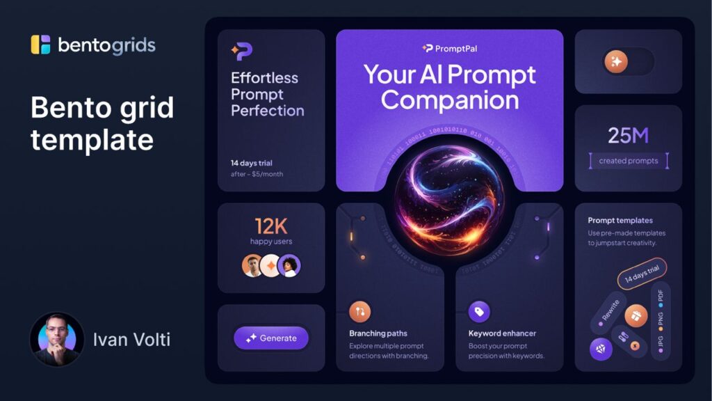
To harness Bento Grid well, designers should focus on content hierarchy first. Ask yourself: what deserves the most attention? Place that in the largest tile. Then use smaller tiles for secondary details or supporting visuals.
Next, balance symmetry and asymmetry. Too much symmetry dulls the impact; too much asymmetry feels chaotic. Vary your tile sizes intentionally to create a visual pulse that draws users through the layout.
Whitespace matters. Generous spacing around cards prevents the interface from feeling cramped, and makes each card feel intentional rather than arbitrary.
Finally, use subtle motion where it enhances comprehension—animated transitions or hover effects can help bridge the static nature of grids with fluid user expectations.
Challenges Designers Should Watch For
No trend is without caveats. Some designers argue that Bento Grids, when used without careful content planning, can become awkward or feel forced. Filling every available area with a box just for the sake of uniformity can dilute clarity and frustrate users.
Also, responsive behaviour requires thoughtful implementation. A layout that works beautifully at one screen width can look cluttered at another if adaptive rules aren’t in place.
Great Bento UI doesn’t just arrange content—it guides users through it.
The Future of Bento UI
As digital experiences become richer and more complex, designers will lean increasingly on layouts that feel intuitive and thoughtful. Bento Grid fits this need by blending modular clarity with visual sophistication. It echoes broader shifts toward responsive, adaptive, and intelligent interfaces, where layouts serve users first and visuals second.
In the coming years, expect Bento systems to evolve with AI personalisation, adaptive content ordering, and subtle interaction design that enhances—not distracts from—core user goals.
Conclusion
Bento Grid and Bento UI represent more than a fleeting aesthetic. They embody a philosophy: treat content like well-served food. Each piece deserves space, accessibility, and attention. When designers adopt this mindset, interfaces become not just functional, but delightful.
This trend is popular because it works. It helps people find what they need quickly and enjoyably. And in a world where digital attention keeps shrinking, clarity isn’t just a luxury—it’s essential.