
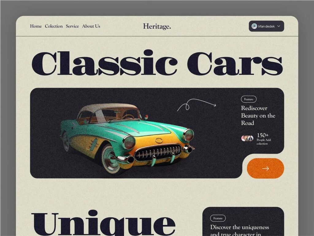
We live in a world where design cycles circle back. After years of minimalist, flat interfaces and sterile “clean” aesthetics, more and more people — designers, brands, and audiences — crave something warmer, more expressive, more human. Enter the resurgence of retro and nostalgia design: the revival of 90s and early-2000s (Y2K) aesthetics that once felt tacky or chaotic but now feel bold, playful, and emotionally potent.
This return doesn’t surprise experts. In times of rapid change, uncertainty, and information overload, nostalgia offers comfort and emotional grounding. For many, retro visuals evoke simpler digital memories, childhood feelings, or early internet optimism. For brands, retro design provides an opportunity to stand out in a sea of look-alike minimalism, delivering character, personality, and emotional resonance.
At its best, retro design marries memory with modern usability. Designers now remix elements of the past, such as neon gradients, metallic sheen, and pixel art, while retaining responsive layouts, fast performance, and accessibility. This careful blend creates experiences that feel nostalgic without feeling dated.
What Makes Y2K and 90s Aesthetics Visually Distinct
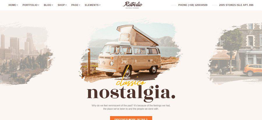
To understand why retro design captivates us, you need to recognise its visual hallmarks. This aesthetics come loaded with a distinct mood, a particular energy.
- Y2K Aesthetic — One of the purest forms of “turn-of-the-millennium” style. It draws on a “retro-futuristic” sense: metallic textures, glossy surfaces, chrome and plastic sheen, bubble-like buttons, and rounded, chunky fonts. You’ll also find bold gradients, synthetic colours (hot pink, lime, electric blue), and translucent or neon elements that echo early digital hardware design.
- 90s Web & Design Vibes — This includes pixel-based art, grid backgrounds, low-resolution graphics, VHS-style neon or pastel palettes, and sometimes even skeuomorphic elements (design cues that mimic real-world objects). Many 90s-inspired designers lean into chaotic layouts, energetic colour clashes, playful typography — early web “do-it-yourself chaotic charm.”
- Retro-futuristic/Nostalgia-Core Variants — Recent years have seen designers remixing both aesthetics into contemporary “nostalgia-core” visuals. This approach blends 90s/2000s energy (chrome, neon, pixel fonts, gradient overload) with unexpected flourishes: animated stickers, clippy-style icons, VHS filters, surreal colour combinations, and even brutalist layout echoes. These designs feel like early internet dreams of the future, reframed for today.
This aesthetics evoke more than just visual memory — they channel a mindset: optimism, experimentation, rebellious creativity, and a hint of digital innocence.
Why Pure Nostalgia Can Backfire
Applying retro design isn’t just about sprinkling glitter and neon. If you treat nostalgia as a substitute for good design, you risk building interfaces that frustrate or confuse users.
- Clutter over clarity: Retro visuals often lean toward maximalism. Such as bright colours, heavy gradients, chrome effects, and animated elements. Without restraint, they overwhelm. Users struggle to figure out what’s important.
- Legibility issues: Neon or overly saturated colours, shiny textures, or pixel-based fonts might look nostalgic — but they can reduce readability. Contrast may fail accessibility standards; text might blur against flashy backgrounds.
- Navigation confusion: Some retro-era UI ideas (skeuomorphic icons, ambiguous design metaphors) might look fun, but modern users expect consistent, predictable behaviour. Overly playful controls risk misleading users or causing frustration.
- Performance and responsiveness: Heavy visuals, animations, stacked textures or shadows can slow down page load or feel clunky on mobile devices. In a world where speed and responsiveness matter, retro overload can degrade user experience.
In short, nostalgia without restraint risks turning design into decoration — pretty, maybe even fun, but ultimately frustrating or inefficient.
How to Blend Retro Aesthetics with Modern UX
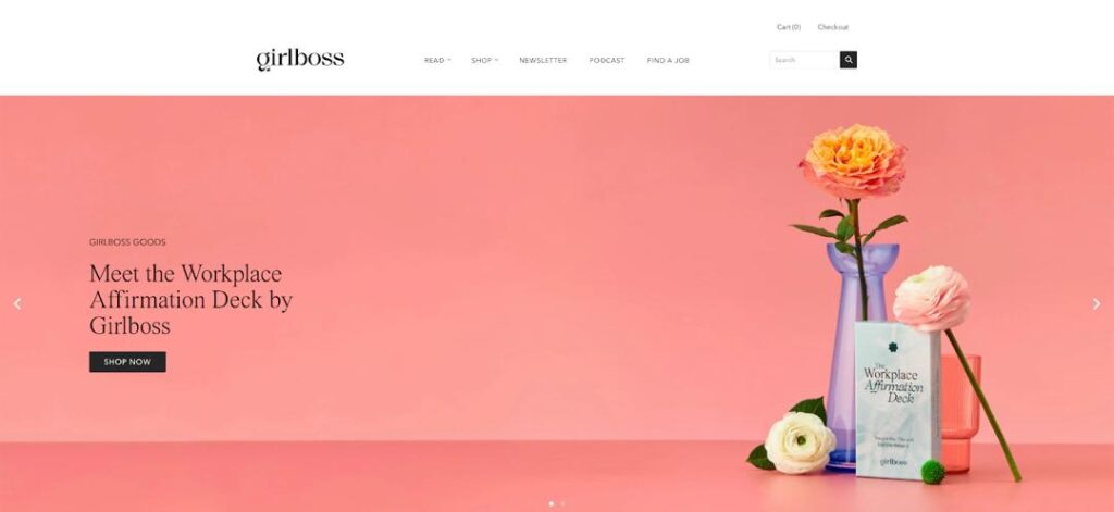
You don’t need to choose between playful nostalgia and functional design. Instead, embrace retro as a layer — not the foundation. Follow these principles to strike a productive balance:
- Build a modern structure first. Use today’s best practices: responsive layout, clear hierarchy, whitespace, and intuitive navigation. Let retro visuals coat that structure, rather than dictating it.
- Treat retro as an accent, not a default. Use Y2K/90s elements, such as gradients, pixel icons, and neon highlights, to add flavour and character. But don’t let them run the interface. Use them in buttons, icons, micro-interactions, and backgrounds — not for core content or navigation.
- Respect readability and accessibility. Use high-contrast colour combinations. Avoid low-res fonts or neon-on-neon text. Offer readable typography. If you apply animations, ensure you provide motion-reduction settings.
- Keep interaction subtle but intentional. Use textures, glows, or shadows to evoke a retro feel, but avoid overloading animations or decorative GIF-style effects that distract more than they delight. Let interaction remain predictable, smooth, and performant.
- Optimise for performance. Use lightweight assets (SVGs, compressed textures), lazy-load non-critical visuals, and avoid bloated CSS/JS. Prioritise fast rendering — a modern baseline for good UX.
- Let nostalgia serve emotional tone, not functionality. Utilise nostalgia to convey your brand’s personality or evoke emotions. However, ensure that functionality — including navigation, readability, and responsiveness — remains modern. Think of nostalgia as the emotional wrapper over a solid UX core.
Retro Done Right
Designers and brands already explore this balance. Here’s what works when done well:
Some indie websites combine pixel art or neon gradients with clean, responsive layouts. They deliver nostalgia without compromising readability or navigation. Designers often use vaporwave-style colour schemes or grid backgrounds, but still structure the content in predictable, modern ways.
Others lean into neo-skeuomorphism (“Skeuomorphic 2.0”): interfaces that hint at real-world textures, such as subtle shadows, depth, soft glows, but stay functional, fluid, and modern. These UIs feel tactile and immersive without the bulky, heavy-handed realism of early 2000s skeuomorphism.
Many brands treat retro design as visual storytelling — using retro style in promotional campaigns, digital art, or packaging — while keeping their main UX polished and minimal. This way, they give nostalgic flair without burdening everyday use.
How You Can Design Your Own Retro-Modern Interface
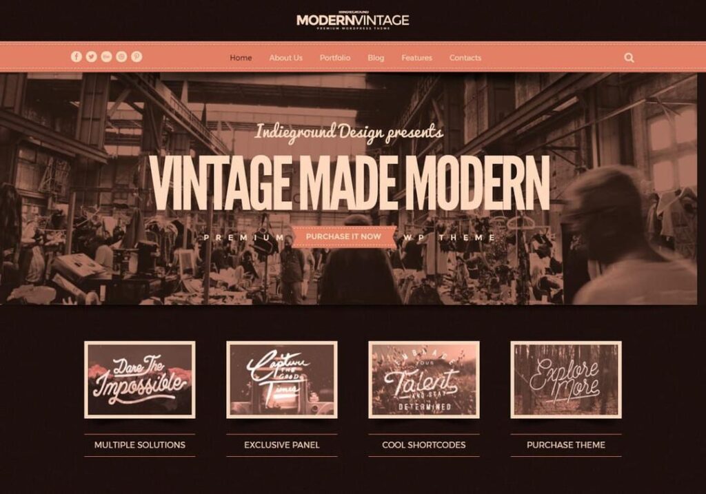
If you want to build a retro-modern UI, here’s a practical mini-workflow designers often follow.
- Define your core UX goals. Start by sketching a modern, responsive wireframe. Focus on structure, flow, and user needs.
- Pick a nostalgic theme — decide whether you lean towards 90s web, Y2K chrome, or neo-skeuomorphic. Keep your intent clear.
- Add retro touches as layers — gradients, subtle textures, pixel icons, retro-style buttons, neon highlights.
- Test for readability and accessibility — check colour contrast, font clarity, and responsiveness. Adjust any retro element that hinders usability.
- Optimise performance — use compressed assets, SVGs, CSS effects rather than heavy images, lazy-load non-critical visuals.
- Get feedback and iterate — show to real users. Ensure users understand the structure, navigation, and interactive elements easily.
With this approach, you anchor functionality first and let nostalgia enhance the user experience — not distract from it.
Where Nostalgia Design Is Headed Next
The resurgence we see today likely only marks the beginning. Several emerging trends hint at what’s next:
- Neo-skeuomorphism + depth interfaces: Expect more UIs that feel tactile, almost “physical” — soft shadows, subtle depth, glassy or glossy effects — but built with modern performance in mind. Designers call this “Skeuomorphic 2.0.”
- Hybrid nostalgia-futurism: Designers increasingly blend nostalgic visuals (Y2K, 90s) with modern futuristic touches — glitch effects, sci-fi vibes, cyber-futuristic palettes that evoke optimism about technology’s future while feeling familiar.
- Personalised nostalgia experiences: As digital culture fragments, people gravitate toward micro-subcultures. Expect UI/UX that references very specific nostalgic memories — like 90s Japanese computing, early web forums, Y2K social networks — tailored for niche audiences who share that memory or fascination.
In short: designers will increasingly treat nostalgia not as a trend, but as a palette, a tool, a language to shape emotional experience — while keeping UX modern, clean, and functional.
Conclusion
Nostalgia is a creative fuel, not a replacement. Retro design doesn’t need to clash with modern UX. It can enhance it — if you handle it with care. By building a strong structure first, then layering nostalgia selectively, by prioritising readability, usability, performance, and by using retro as an emotional or aesthetic accent rather than a default, you grant users both the comfort of memory and the smoothness of today’s digital expectations.
When you hit that balance, nostalgia design becomes more than a throwback. It becomes a bridge between past emotion and present usability — a playful, human, resonant way to connect across generations, memories, and digital cultures.